Port of Long Beach:
Rebrand + Site Overhaul /

See how I teamed up with an aspiring, up-and-coming agency to help win the business for the Port of Long Beach, resulting in an avant-garde corporate rebranding and an ambitious website overhaul effort.

Summary /

A long time friend and recent founding member of Stellar Agency of Torrance, CA texted me one night, they needed help. Within a couple days, actually three late nights and numerous texts and emails later, I churned out a few comps, handed them over and the rest is history.
‍
Learn how I turned in a stellar design and won the pitch work in a pinch.

The challenge /

The Port of Long Beach was going through a sea change. With a long, rich history in leading the country in shipping goods around the world and across the country, they were in need of a complete revamp of their brand and overhaul of their public facing, informational site. Their site was dense with information, multiple navigation tiers, no real hierarchy or directional cues. How do you take massive amounts of information and highlight features that pull users into the dynamic and vibrant world of the port?

Insights /
One saving grace POLB had in their back pocket was not only a treasure trove of large scale, beautiful high resolution photography, including rich color high altitude shots, but their internal team was completely design focused with modern sensibilities and their one mandate was to design and build an award winning interactive site like no other. A final feature of POLB is the community and how the port makes a positive impact on peoples lives everyday.

Solution /

Make use of one great photograph after another. Ships shot from helicopters, make for beautiful imagery. Start there.

Next, create a detailed, interactive map of the port that allows users to examine business potential. Then be sure to use the map to connect the port’s geography to key issues such as plans and contributions to the local economy, environment, community and state of the art port facilities. Follow up by showcasing the many stories of how the port impacts the community and then provide easy to access information about the port’s positive contributions it's made.


Marquee
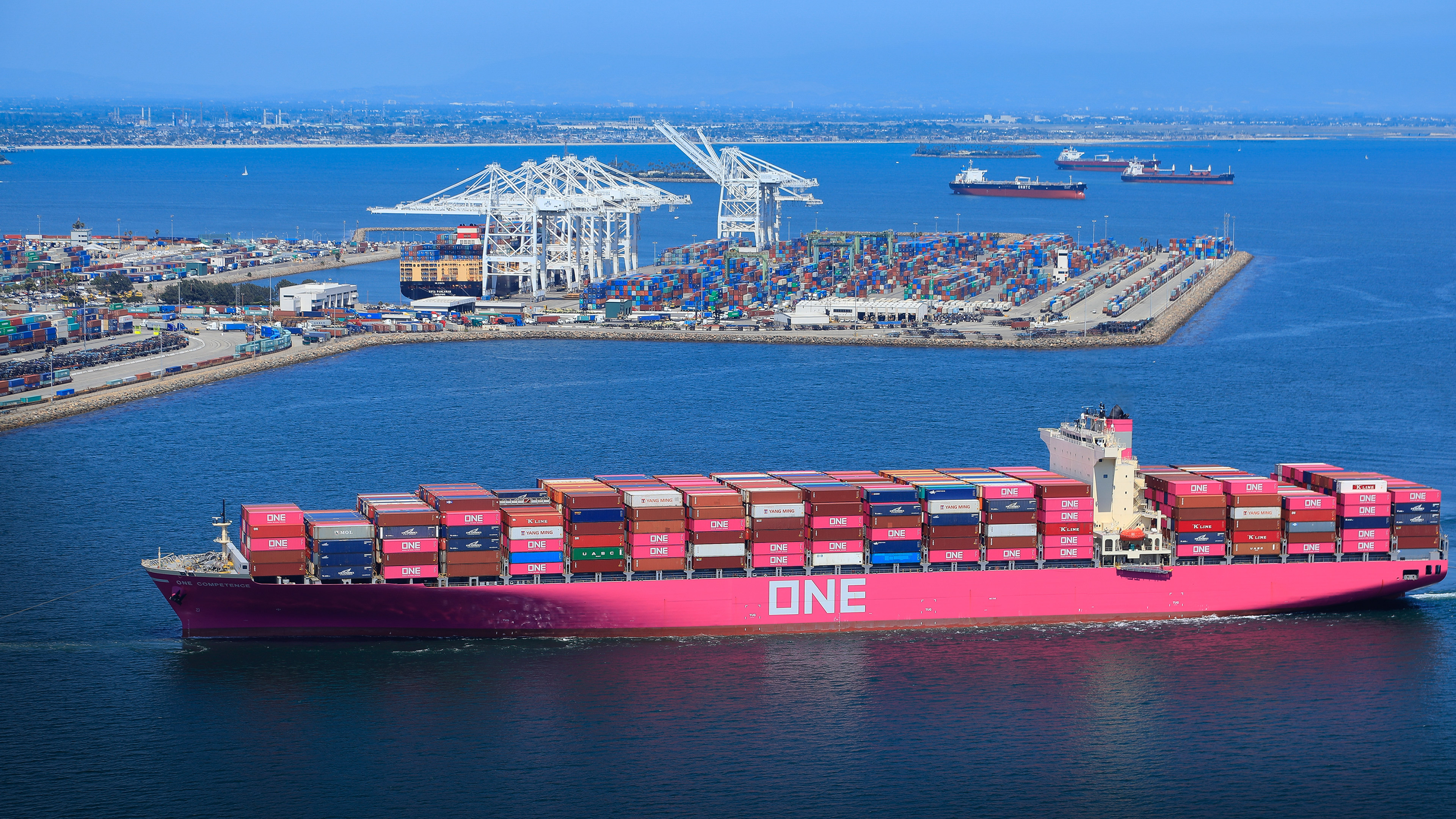
Most marquees for the last decade have been left justified or center, middle frame with your typical headline, subhead and learn more CTA or some derivative. And believe me, I’ve been designing that way for twenty years since the redesign of Quicksilver in early 2000. Full frame imagery with light, draw you in type text overlays and navigation that blends into the imagery.
‍
To play off the horizontal nature of ship and port photography where you have bright colored ships center to mid/lower frame over dark blue waters with cityscapes fading off in the horizon toward the top, I decided to turn a convention upside down. I focused on a headline / subhead lock up area to sit bottom left frame. This would serve a double purpose where UI controls for video could live if it called for it. CTA’s would fit nice and tight there as well. Choosing imagery then became critical in finding directional, contrasting colors, leading directly to the headline, not to be missed.

Just under the main marquee resides a Port at a Glance section breaking up the page between the top imagery and the interactive map, one of the main features of the site. This visual change is to give the user at a glance, quick and easily digestible information packets important at any given time as the data changes.
‍
Interactive map of the port

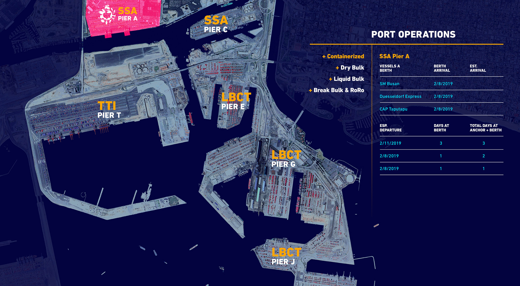
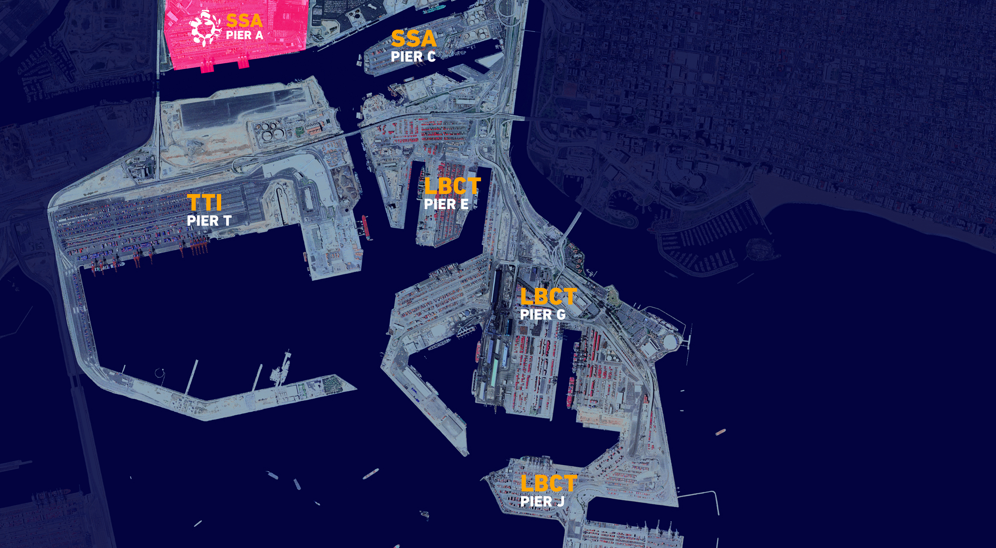
The interactive map of the port was originally derived from this beautiful, topographical photograph of the entire port area. With it’s deep blue hue of deep ocean water and the stark contrast of the port and land—very graphical—it made a natural choice for such a section.
‍
The map let’s users explore the potential for their businesses by showcasing where each pier resides and their facilities, the main cargo types such as containerized, dry bulk, liquid bulk and more. It also shows what the latest projects around the port are and where so users can learn how to avoid traffic or to just learn more about each project. Highlights of the pier are also found here.

Port Resources, News, and Port Calendar /

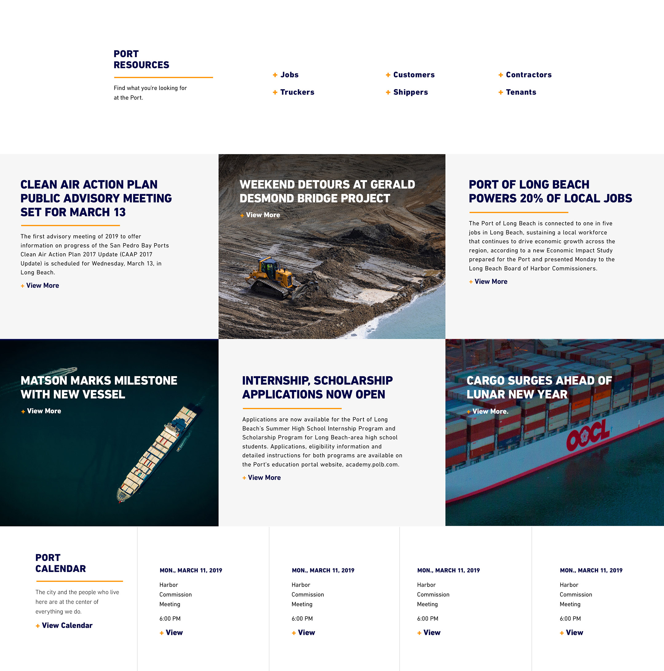
Moving down the page, the user then gets a full look at port resources, top news stories, and a handy port calendar to check the latest events, community, and harbor related meetings.

During the design iterations, I played with numerous color palettes and finally arrived at what you see here. Dark navy blue with a touch of goldenrod or a mustard type hue. Completely subliminal it just started to feel right and then it hit me. It started to have a real nautical, sailing type palette. Sometimes in the design phase when you play around enough, the right direction starts to surface and it's only afterward you realize it's the right direction and why. Funny how that works.

Port History /

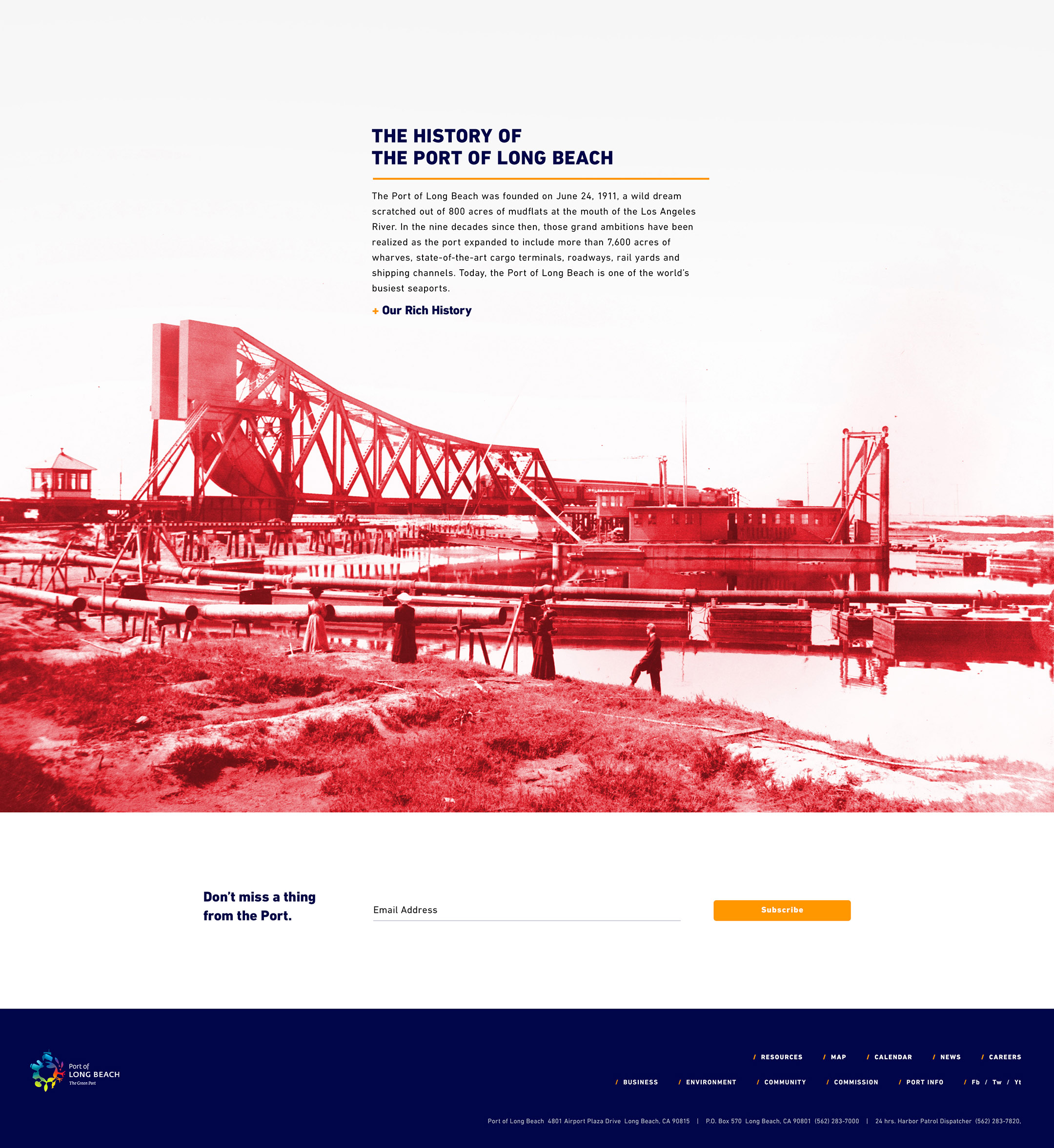
The history section in this comp is my favorite part. It came about like before, there was this really cool old photo with a lot of white space. Very graphic with bits jutting out here and there. In the midst of playing with it, I decided I needed a tertiary pop of color to really set this section apart and create a sense of delight and wonderment in the discovery of this gem. The color was taken from the high altitude shot of the port where you see a lot of this bright reddish color on land type hues.

It worked in wowing the client during the presentation and is held in tact on the final live site, leading viewers to a timeline of the port.

Port Business Page Detail /

In the majority of my pitch work or presentation work, when I’m showing a client what to expect in their site, I typically do multiple pages with multiple states, all done visually with as real information as I can source. I like to give the client a full sense of what type of story we are telling through user journeys. However, this was no ordinary pitch.

Stellar was in the third round with the client. I was asked to do a last ditch effort so to speak to win the business. Just a homepage and sub page detail was necessary to give the client a sense of what to expect. The business page was selected as it had enough data to highlight to be different with just enough time to comp.

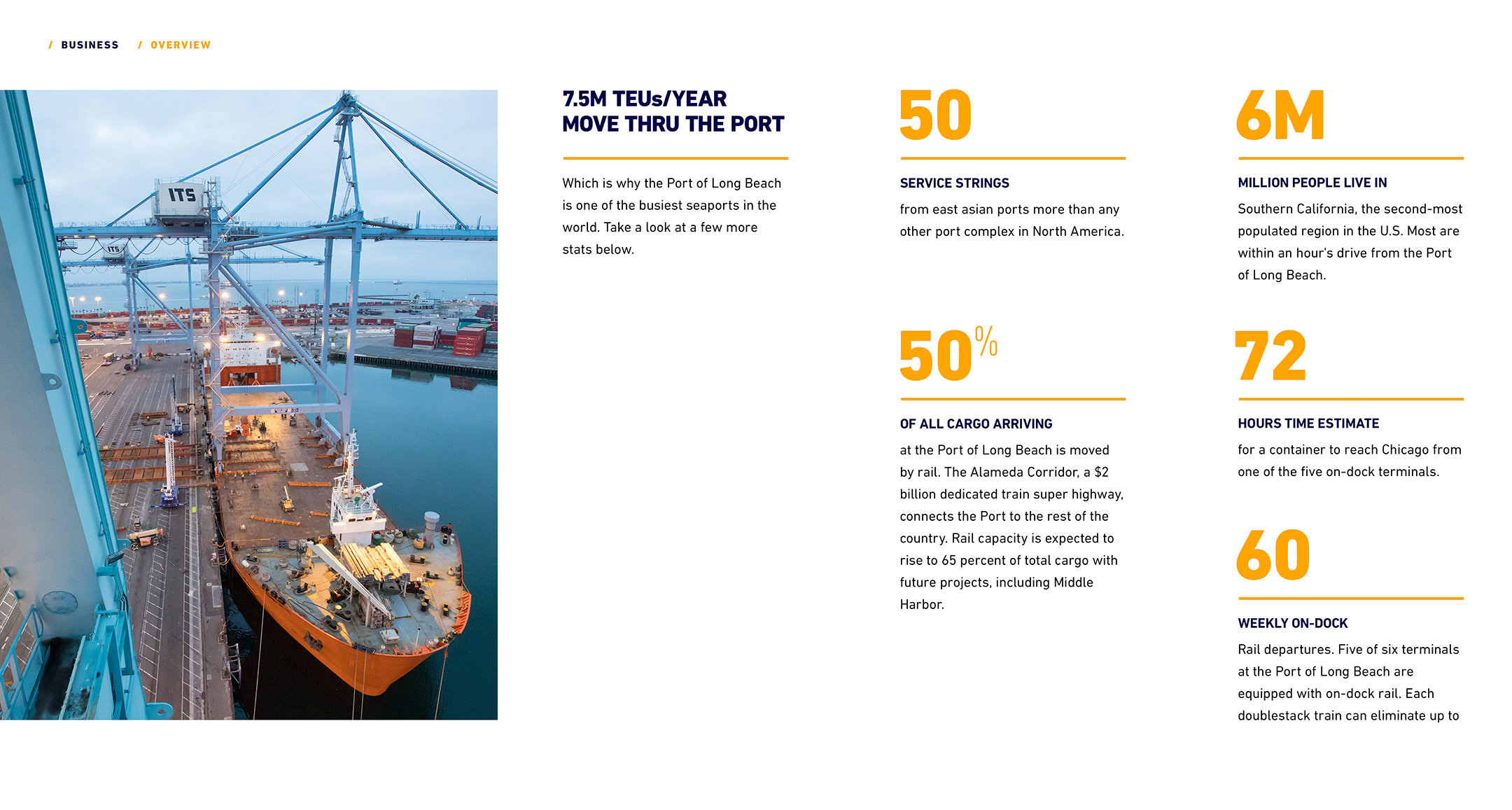
Banking off another great, full frame image, this page leads the user to a business focused set of stories and data relevant to the port.

Port Business Detail Overview
As you move down you see a data driven section highlighting port stats, facts, and relevant storylines giving the user a full sense of what the port has to offer.

Port Interactive Map Detail
The idea here was that once you move off the homepage to the interactive map page the user would be able to get any number of pieces of information useful to them just by clicking on each section of the port.

In the final live design, there are several subsections you can choose from such as Piers & Facilities, Cargo Types, Projects, and Highlights giving a much richer and denser informational experience.
‍
One of the main problems to be solved was the sheer amount of information POLB had on their old site. After the designs left my hands, the amazing team at Stellar expanded on the interactive map and gracefully incorporated this information deluge.

Conclusion /

Overall it was a great experience! I was glad to be able to jump in and help a friend in a pinch, and dually proud to be a part of the redesign of one of the most visible and known ports in the world.

When the final word came in, “You’ve won the business”, I was thrilled for the fledgling agency and to have my work selected to move forward with.

You can see the live site, in action and see how it’s transformed at POLB.com.

Results /
‍
This site launched Feb 26, 2020. There is plenty of buzz about the redesign but the results are still coming in.

Data Driven Design /
‍
Distilled large amounts of information into easily digestible bites, funneled in to categories for quick consumption.

Built on it's strengths /
‍
Integrated stories and news from around the community juxtaposed by rich, beautiful, expansive photography.

Win, Win /
‍
Created a win, win situation between an scrappy, up-and-coming agency and a newly formed internal POLB team.

Email me

Find out how I can work with you.