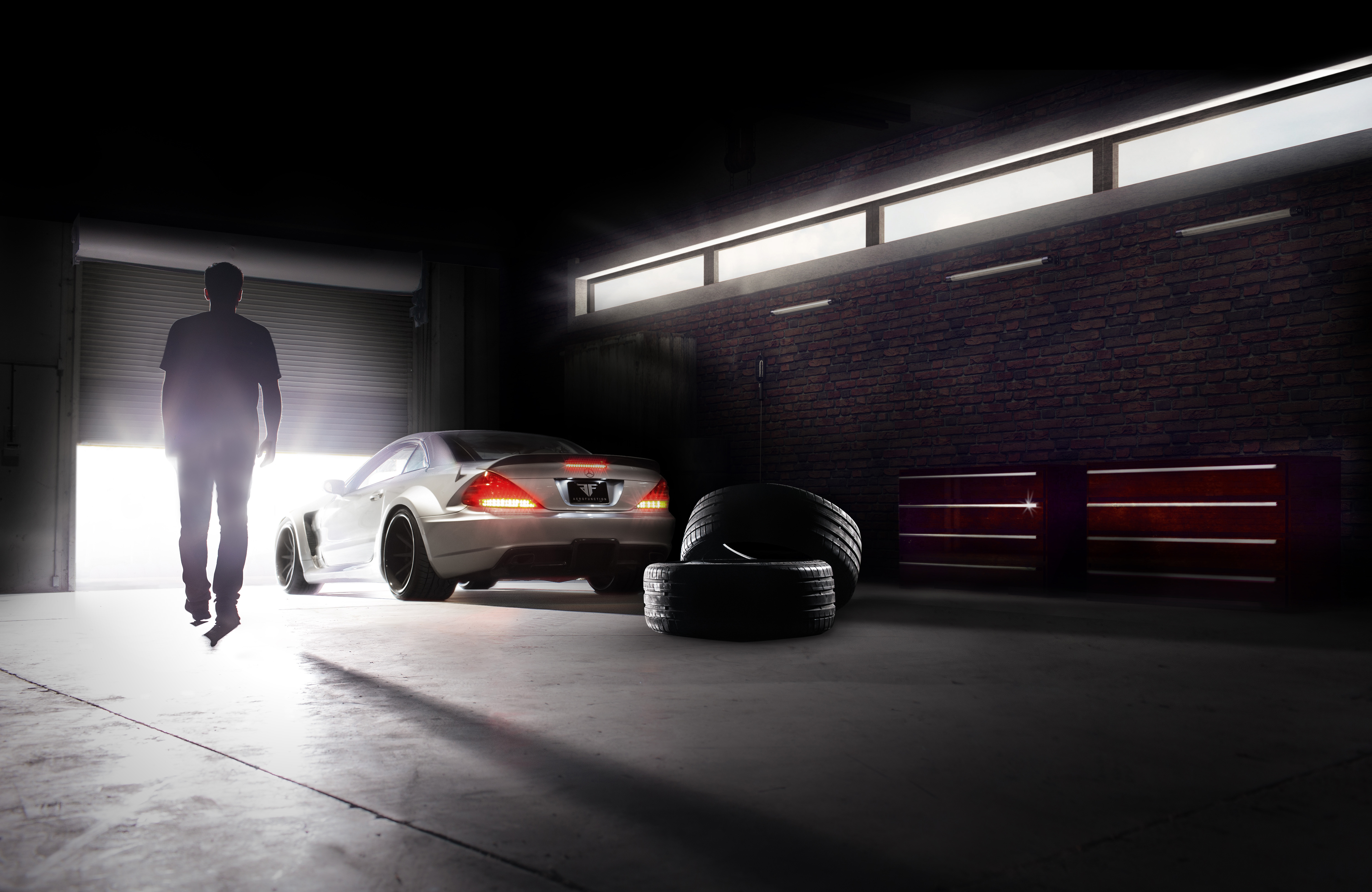
Learn how I lead principle creative direction + design and developed a solid brand evolution then finally a content strategy for one of the world's oldest and most coveted brands.
Continental Tires blends more than a century of manufacturing expertise with today’s leading edge engineering and technology, for style and performance that are steeped in tradition, while at the front line of innovation.
Learn how I took tradition and took it into the new century.
Take just a single, dated logo, give it a complete modern take without actually disturbing the original lettering and prancing horse then design and execute a rebuild of their USA site from the ground up, foundations and all. Develop a unique and engaging tire finding experience, linking in with their vast dealer network from your car to their dealers via a store finder, never before done. All the while making sure the responsive site was completely mobile friendly for consumers on-the-go. The vast majority of the tire buying experience.
Insights /
Studies have shown that from the time you first realize you need a tire—say from a flat or discover wear—to the conversion time in store is less than 6 hours. With that in mind we geared our experience toward mobile users keeping enthusiasts happy. Please browse the various sections below to get further insight into this major redesign of a brand 150 years in the making.
After the business was won I set my path to define creative elements that helped put strategy into action. A single illustration from the original concept was the place to start. The client insisted that it be included somehow as they really loved it. It's really what sold them on it which is interesting. Sometimes you just can't tell what's going to resonate either big or small in a concept.
Visual, typographical and storytelling components were used to demonstrate a content experience designed to be compelling, efficient and educational to the mainstream consumer, while still welcoming enthusiasts.
Brand and UI kit
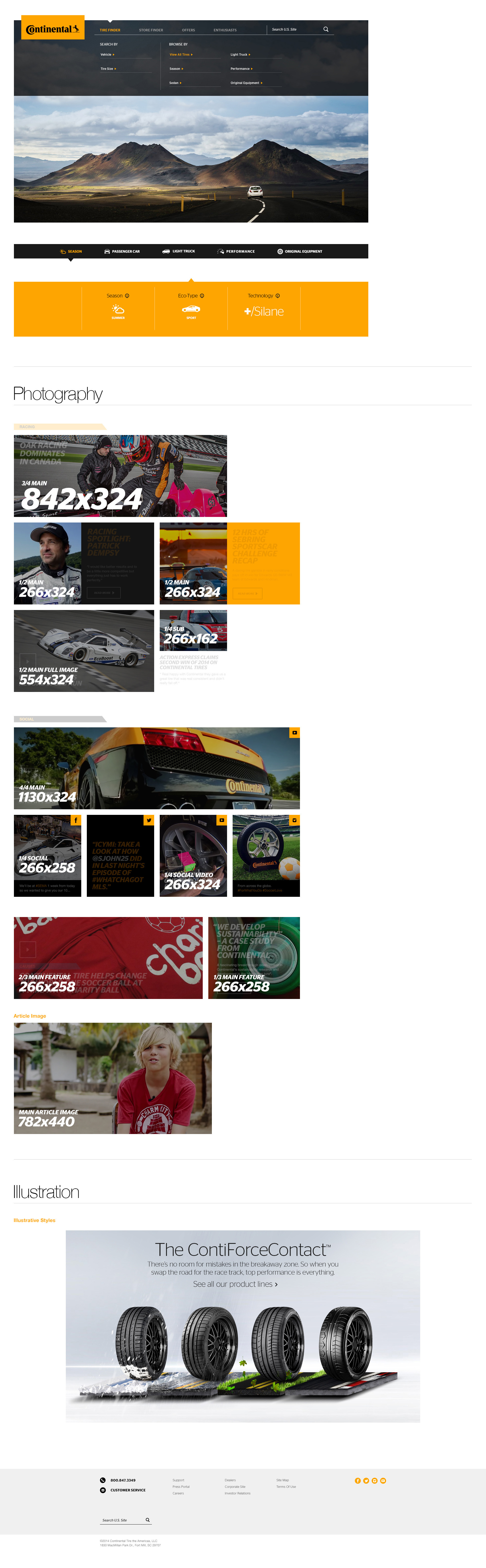
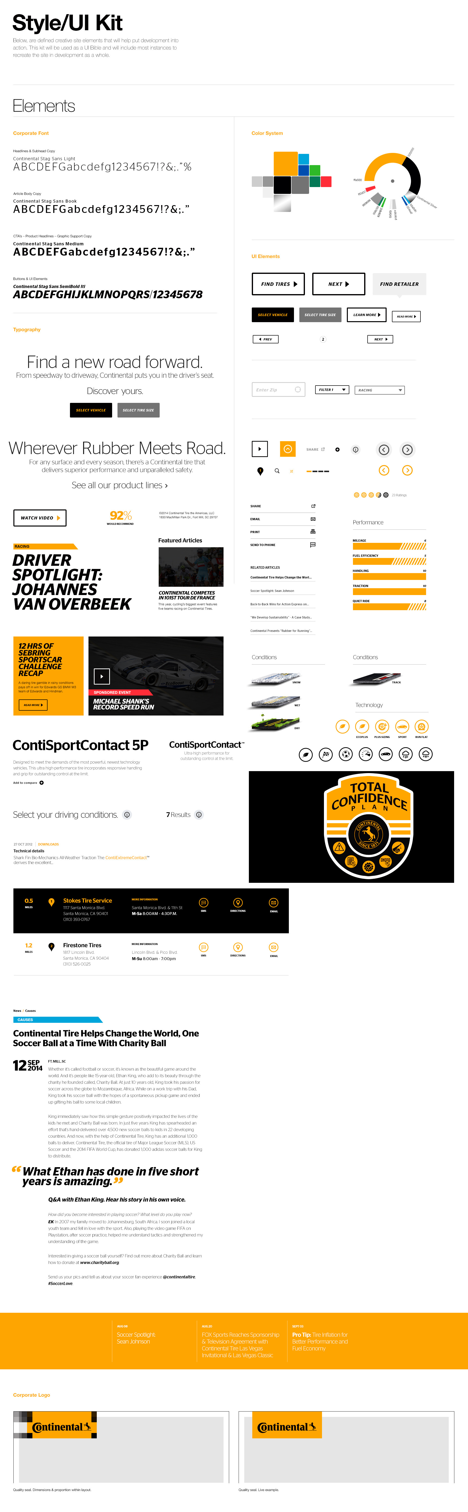
Once you get a style or mood board and concept, set and agreed upon, you can then start building your brand elements which then leads into a UI kit. This is really the bible that will be referenced over and over until the brand changes once again. It has to be easy to use and be build in a way that elements can be grabbed modularly and dropped into any design comp the team needs in production.
Below, see how I created an in depth brand and UI kit that lists out every element to build any page from and more importantly, how to use it in context of any given page, illustration or image.
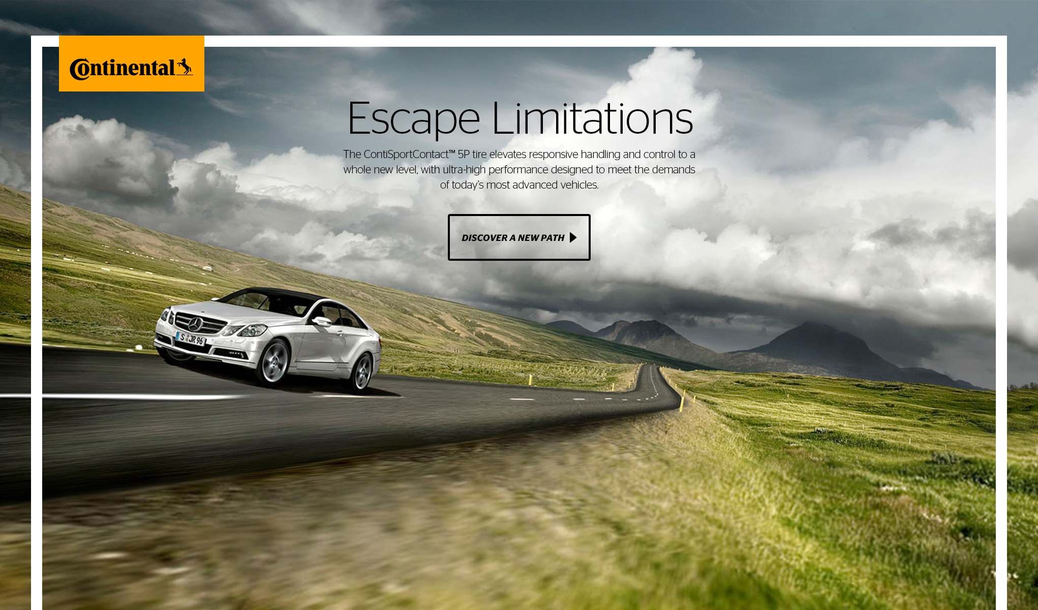
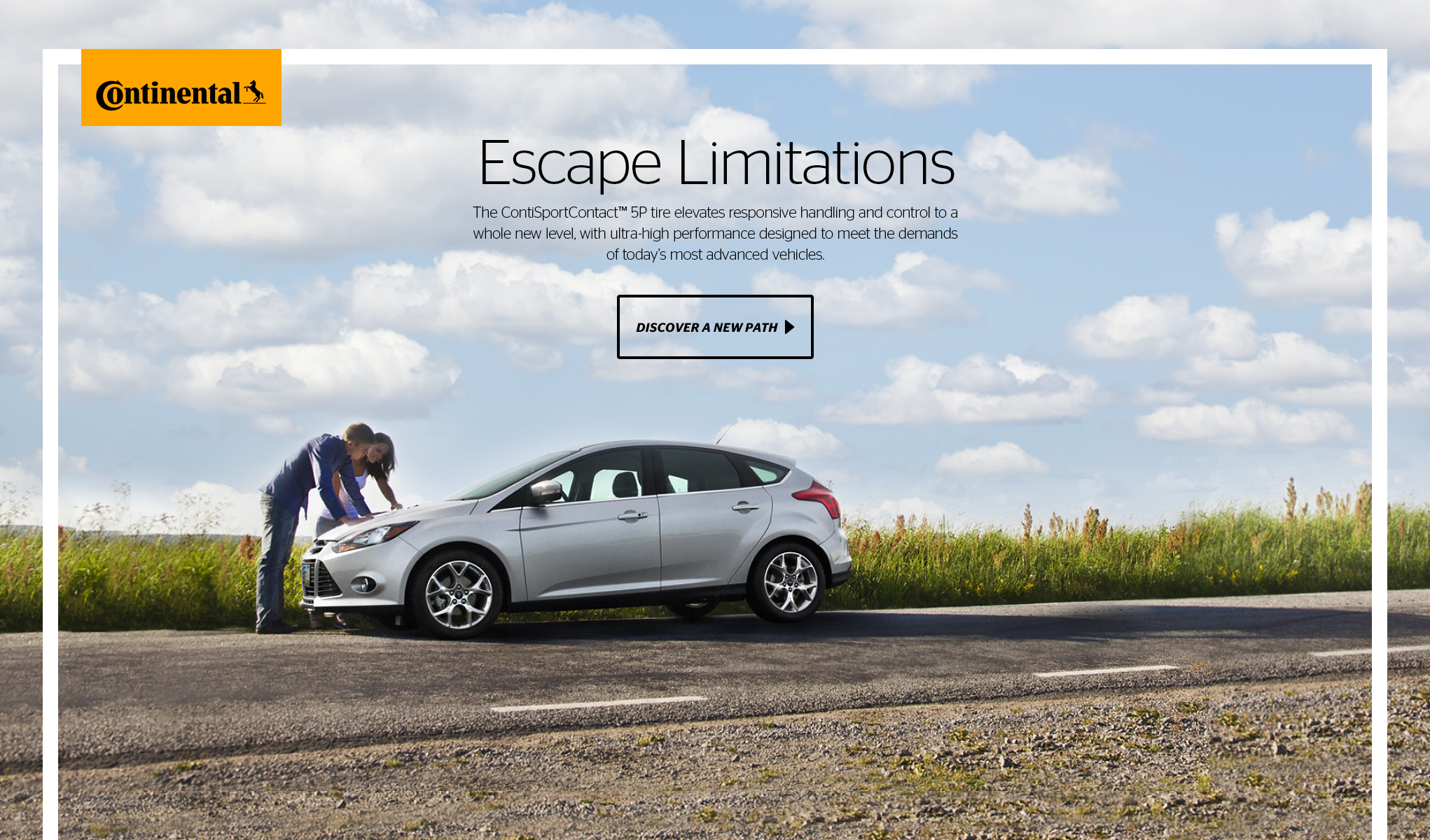
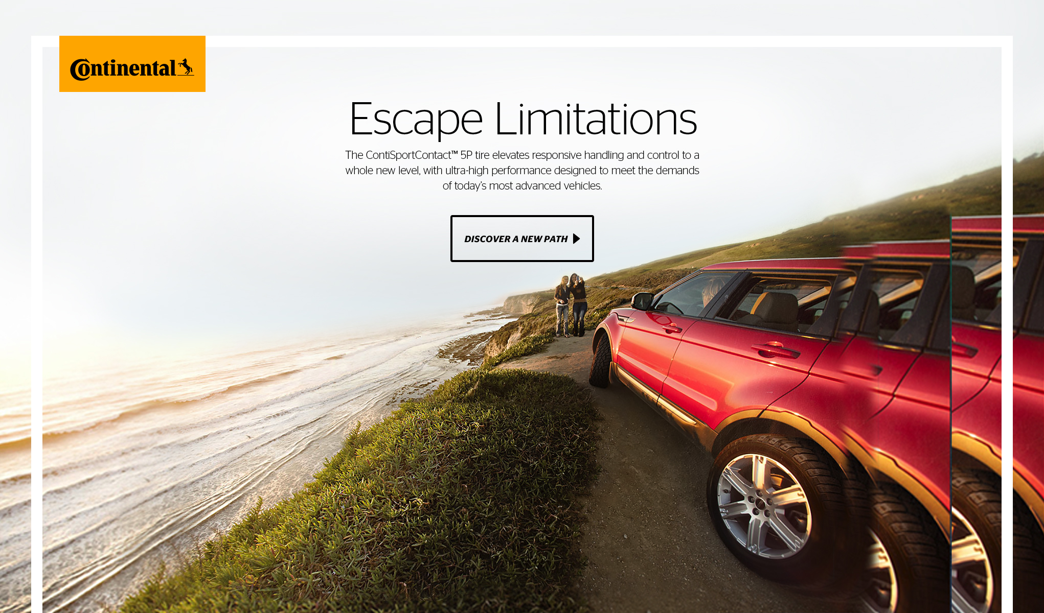
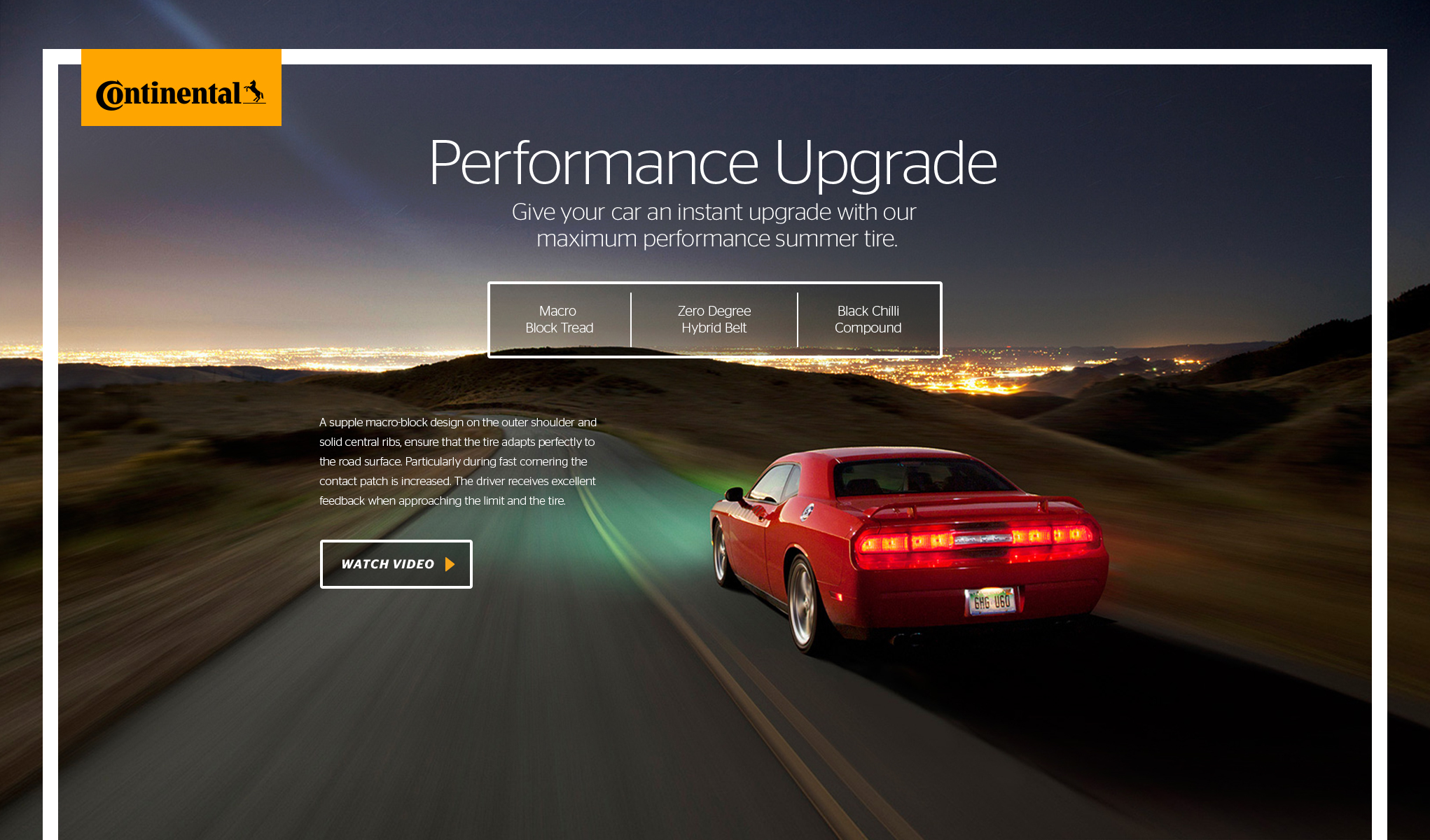
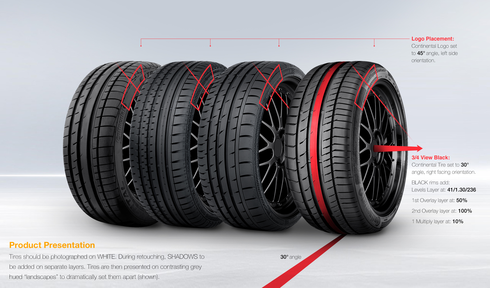
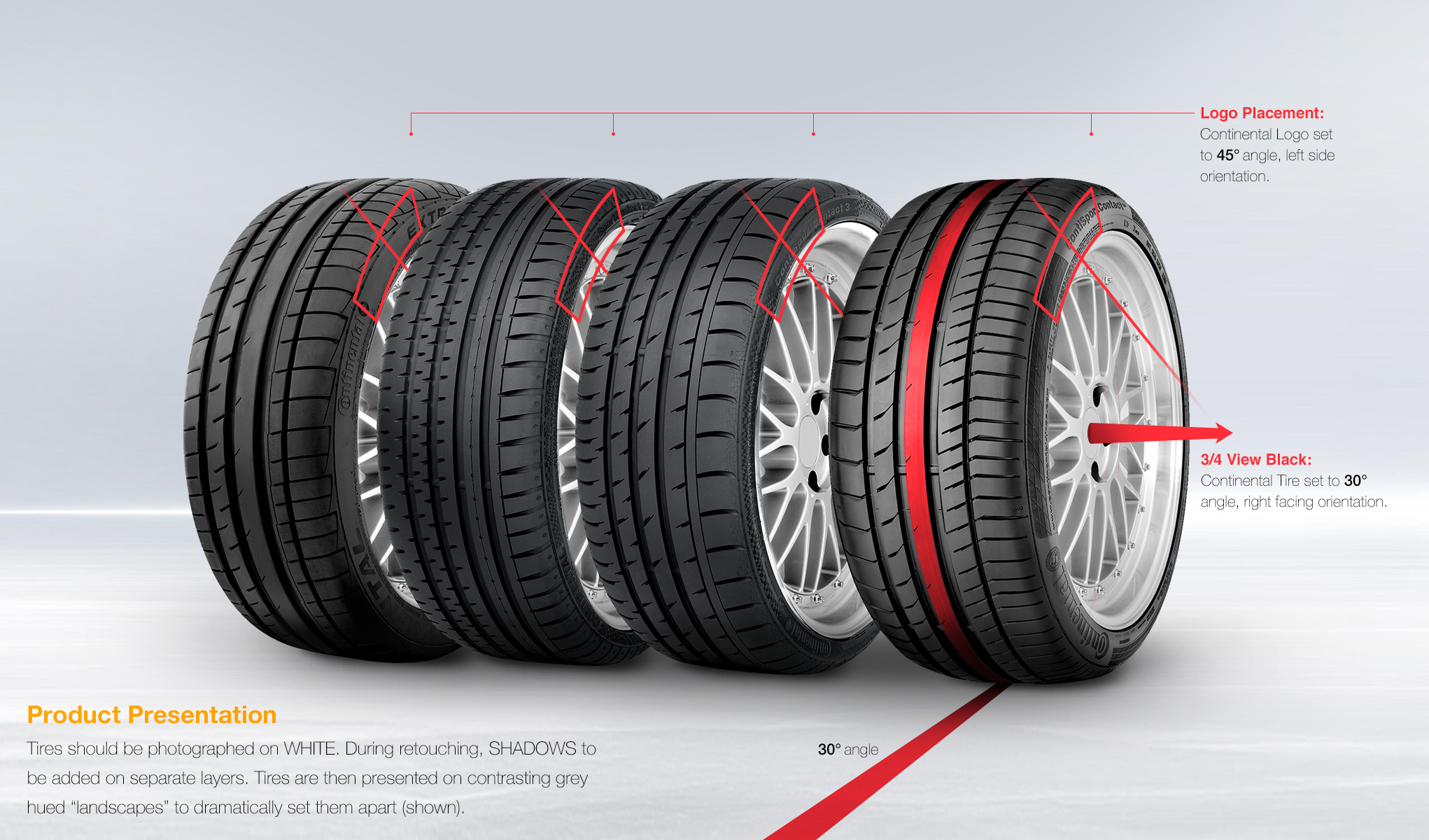
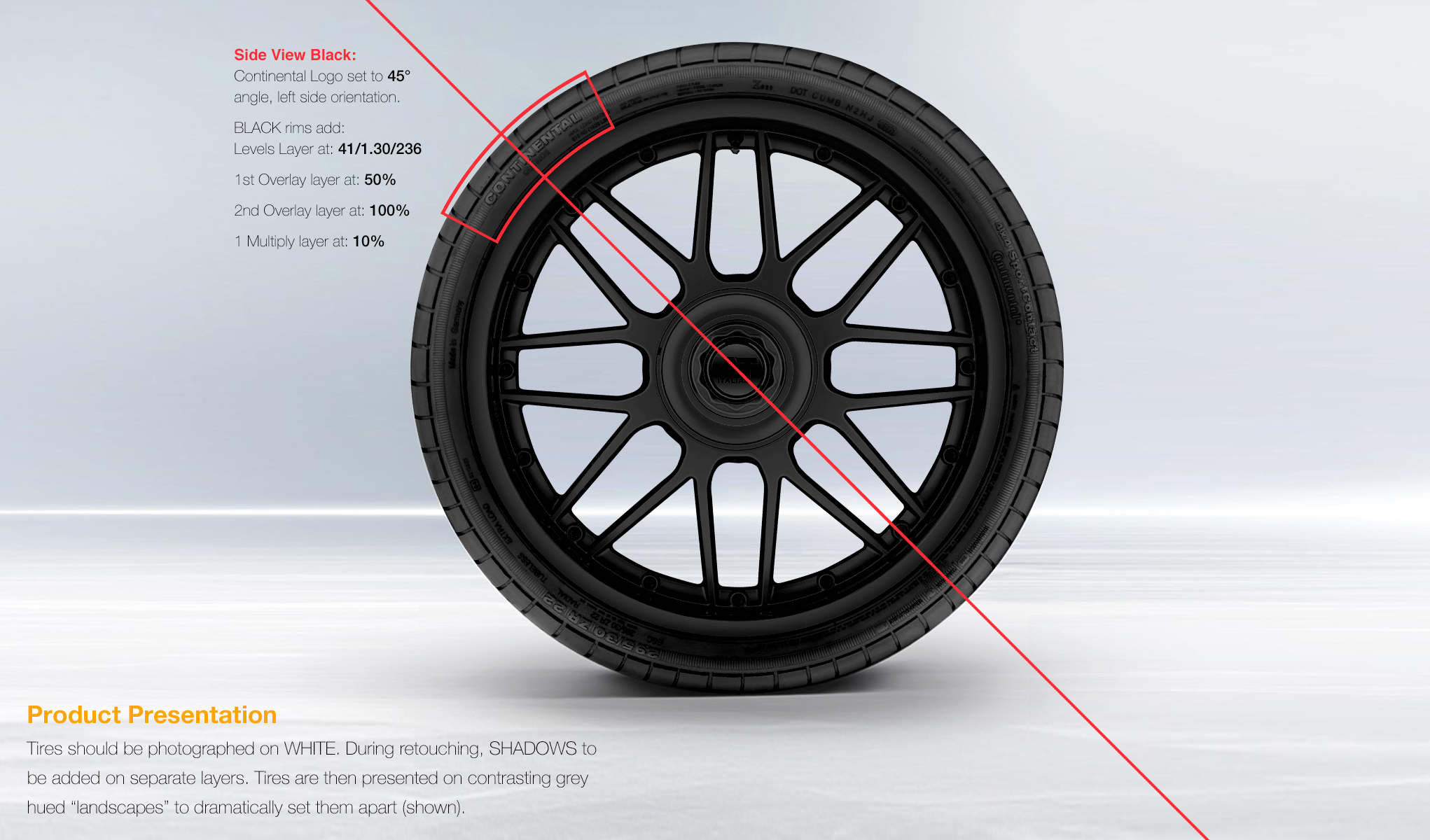
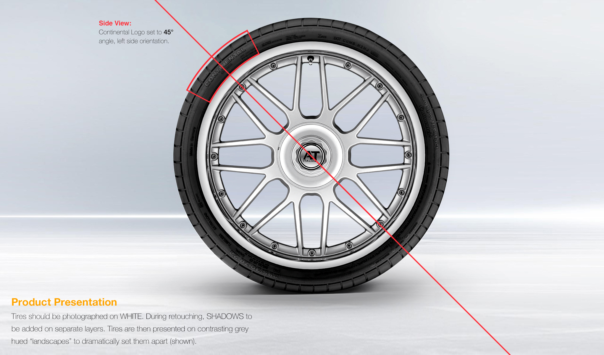
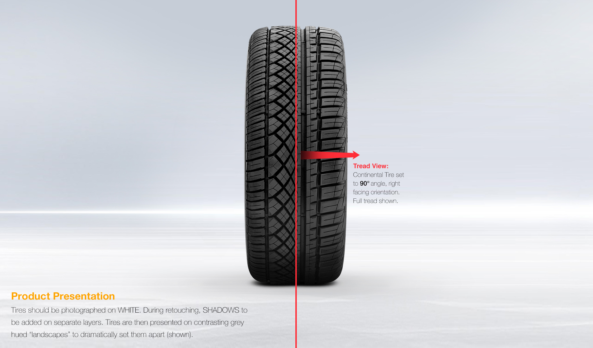
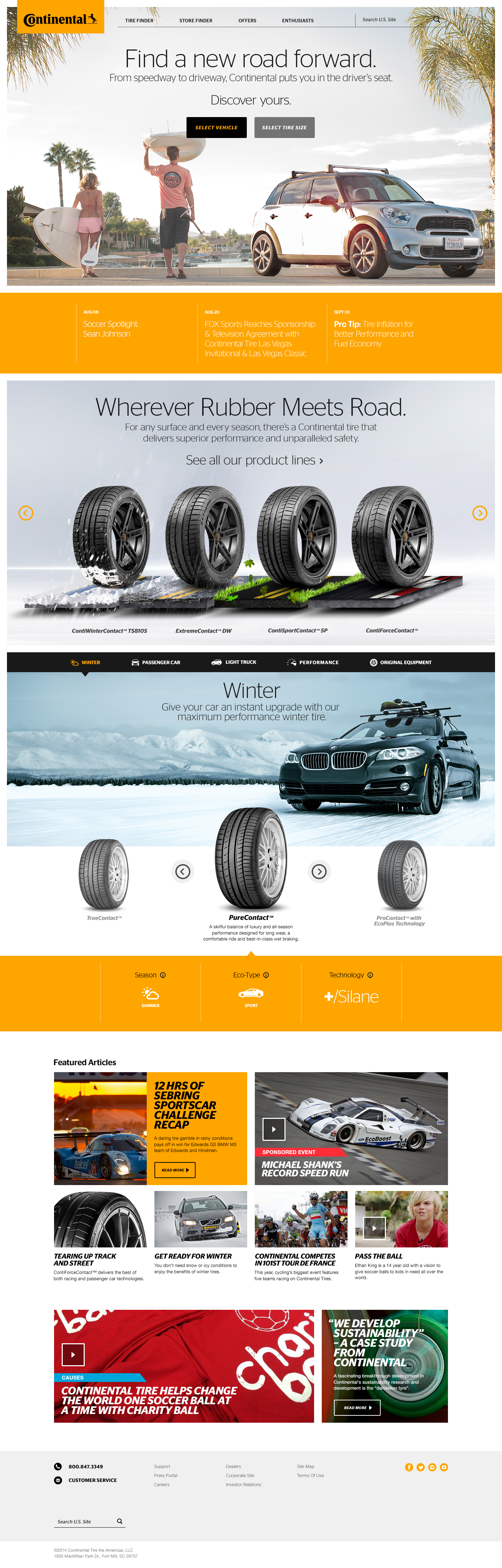
One of the main challenges of the project was to get a vast disparity in photographic style, tire angle, rim type, color value into a consistent family of product through a large product line of tires. And then setting up guides for production to make sure consistency was king. Another problem that soon became apparent was how to make sure breathtaking photography could play well with a set space of typography.
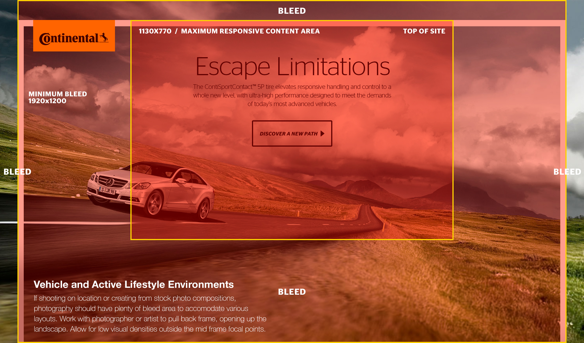
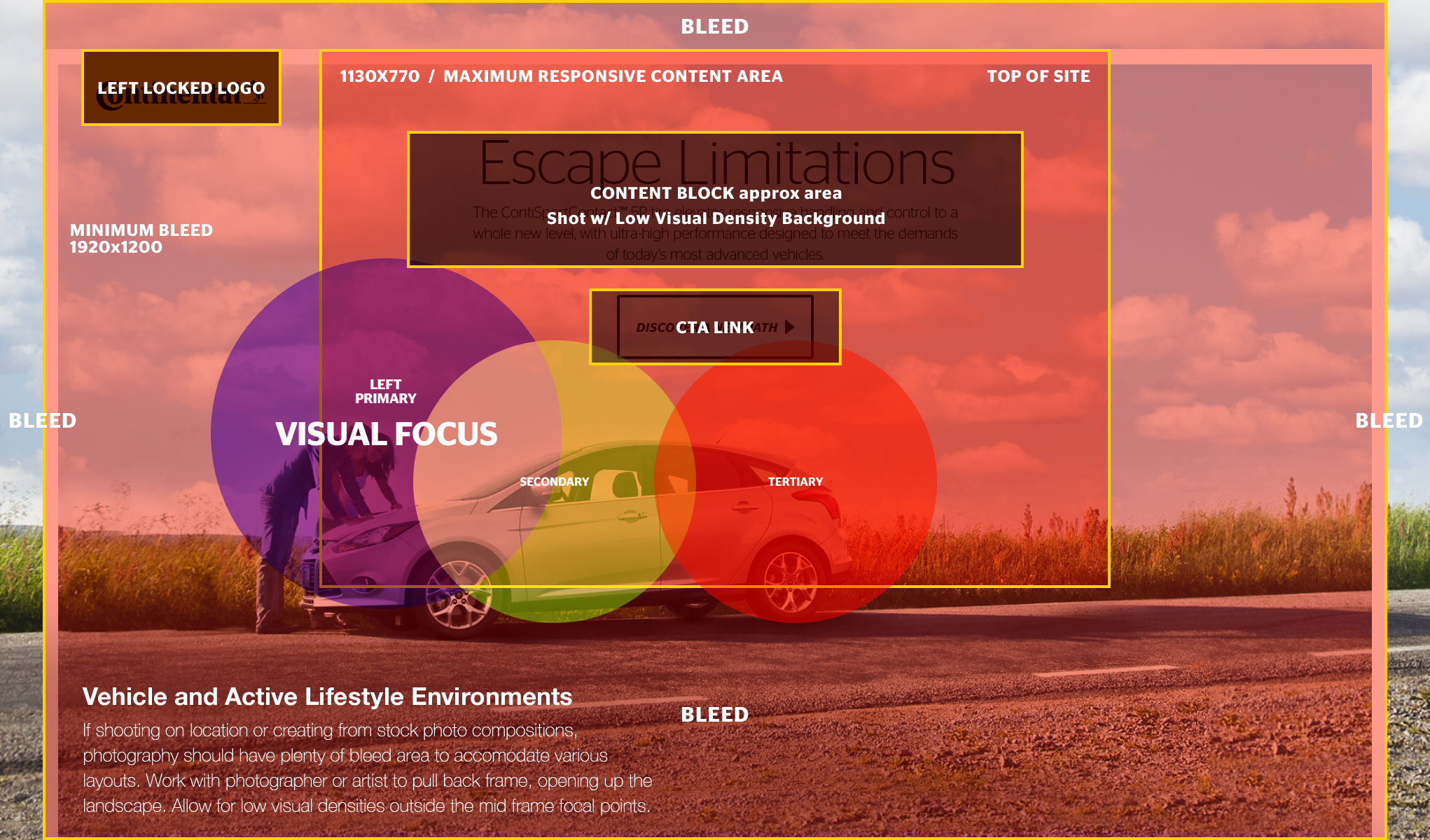
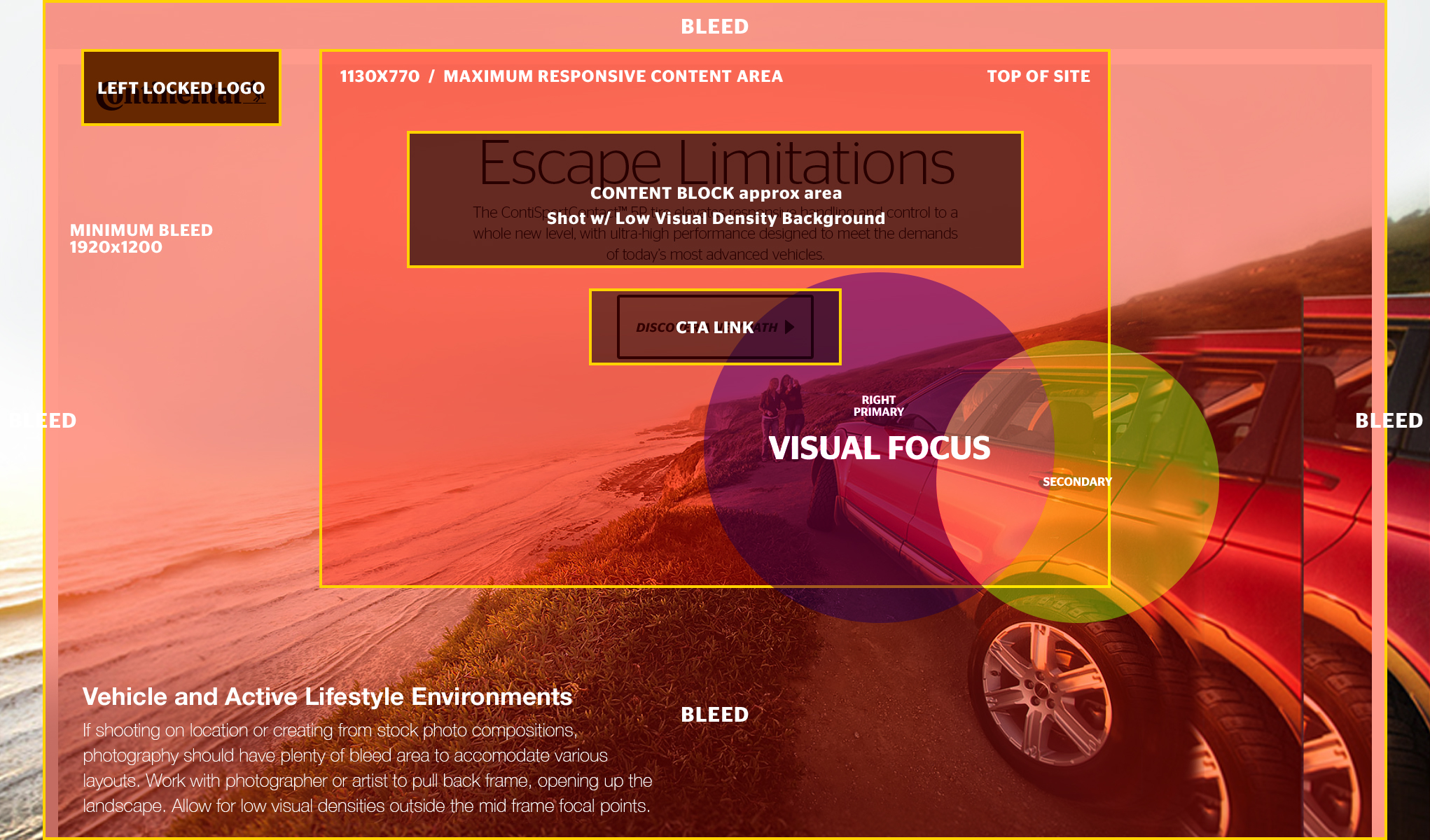
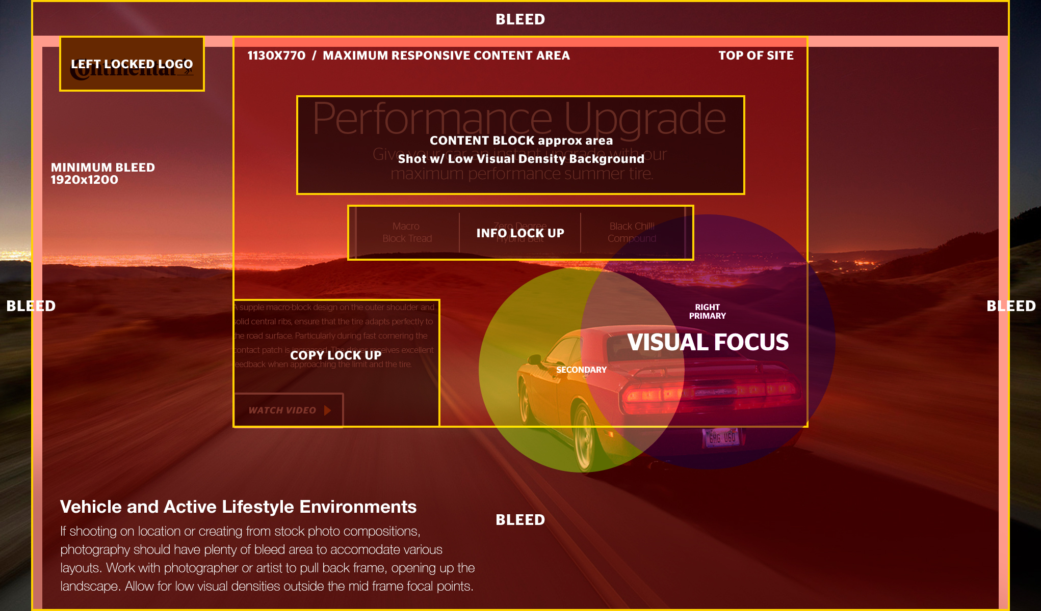
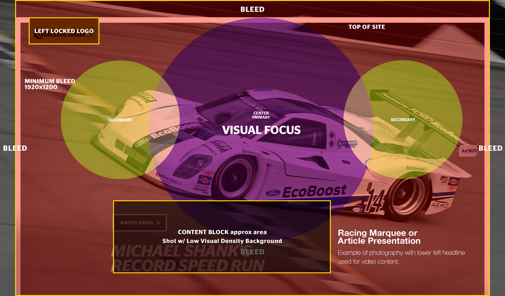
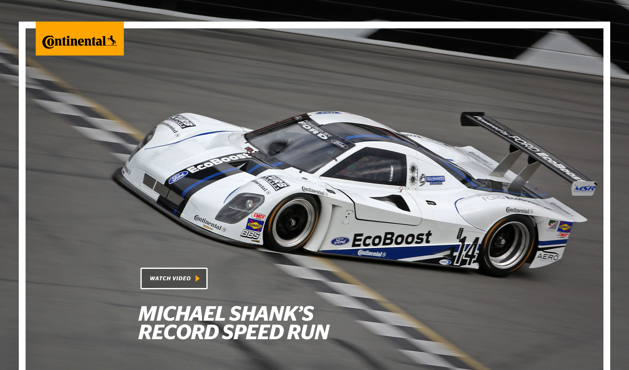
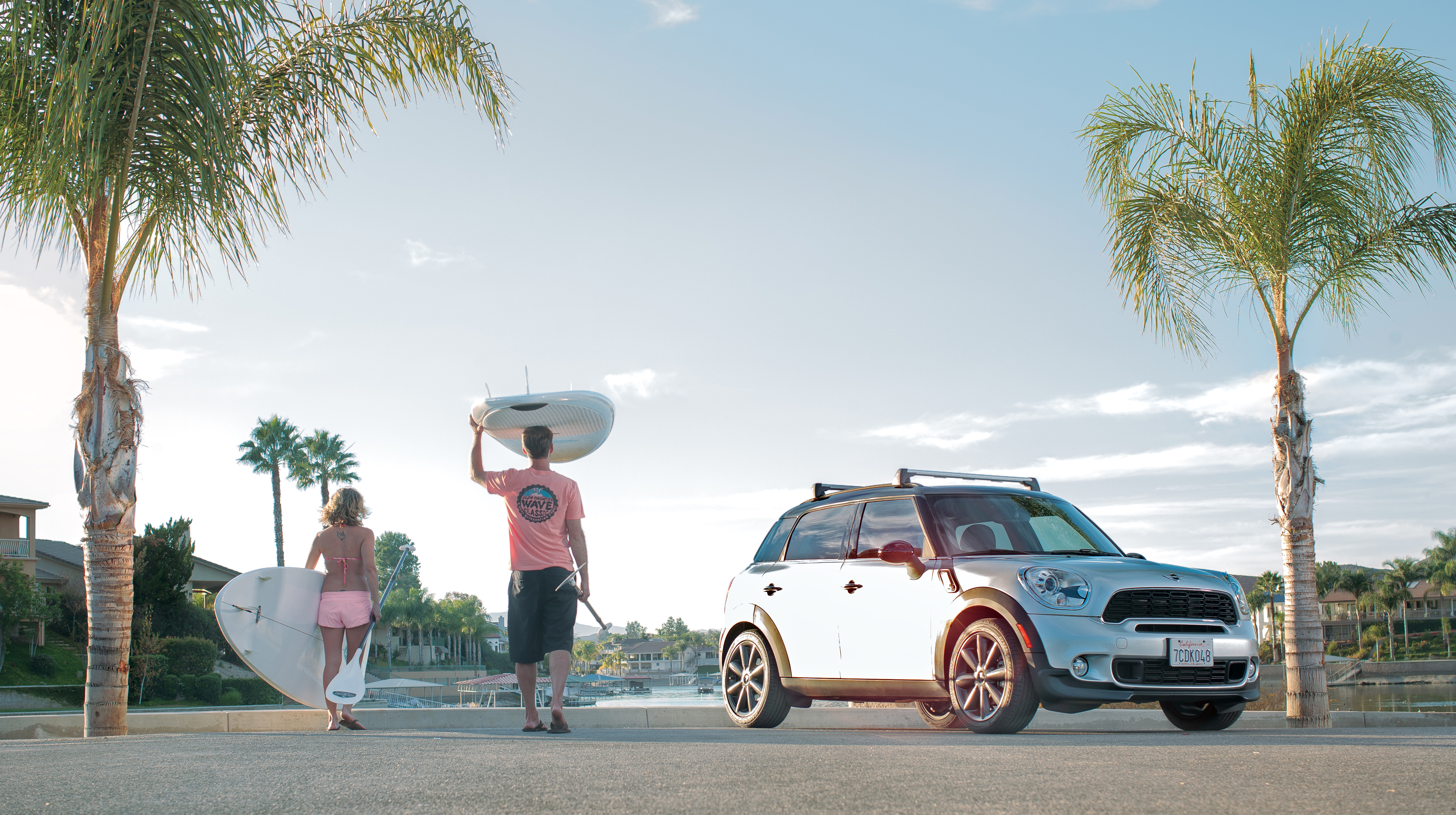
The solution was to create a visual guide for photographers so when they are in the field they can set up shots that will have effective, useful image information for headline marquees, section banners, and ads of various proportions. One thing I found at this moment of the project was that photographers tended to frame their shots as they shot, not allowing for much freedom in cropping.
I needed to have more openness in the shot so I devised a guide with a set of visual cues to instruct the photographer in the field to frame the shot, then step back ten feet and open up the scene. This then allowed to get great photography that could then work better with a set typography space and you now had more room to frame for the marquee or section banners better.
Companion guide
In addition to this field guide, a companion guide for shooting tires in the studio was created showing how each tire should be set and shot at the same angles and with the same light and color information, creating a catalog of tires with visual consistency.
After 6 years of the site in full use, I’d have to say this one one of my proudest accomplishments as Continental still uses the guide. It’s evident as all the tires are very consistent.

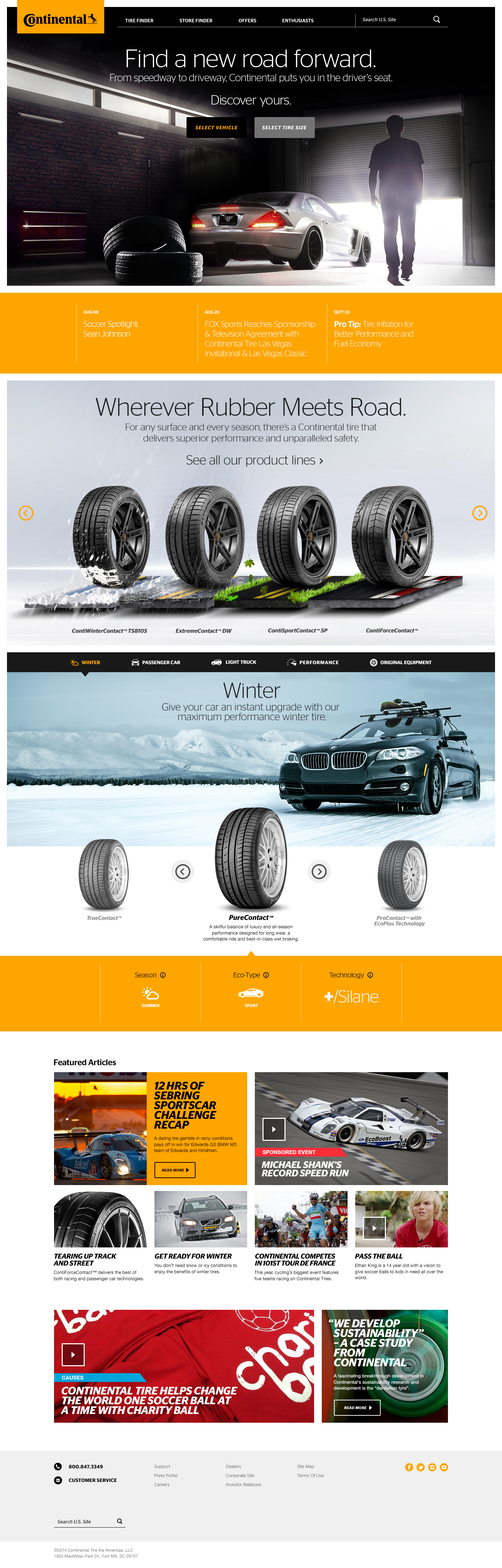
The main challenge that took the most time to solve and most back and forth with UX and design was the tire selection system within the home page layout, the compare tire section, and the product detail page as you'll see further on.
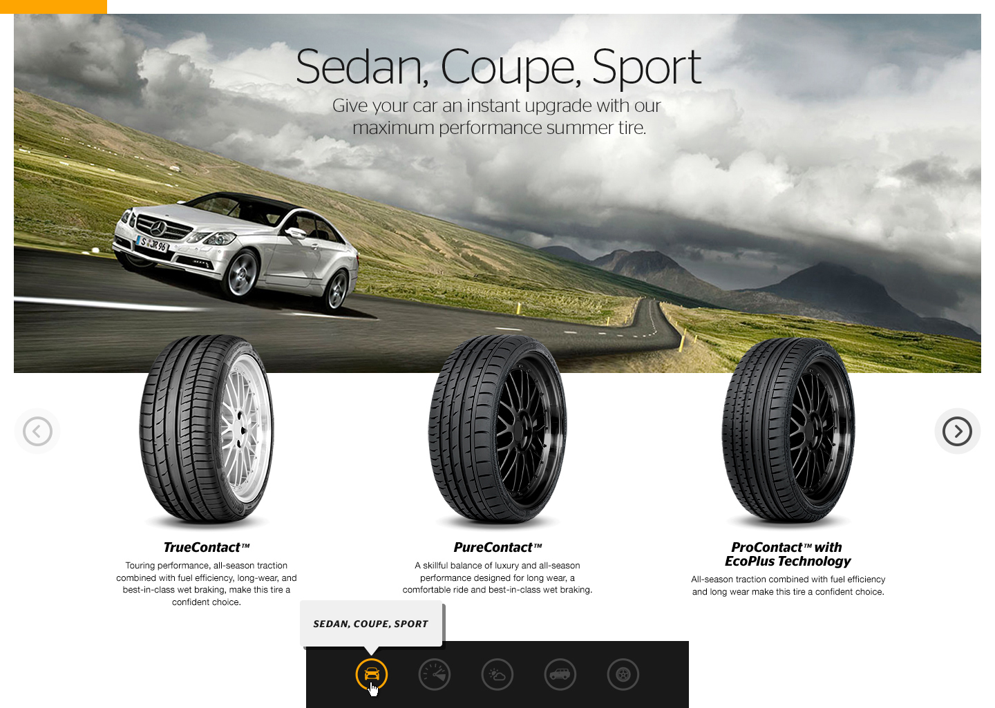
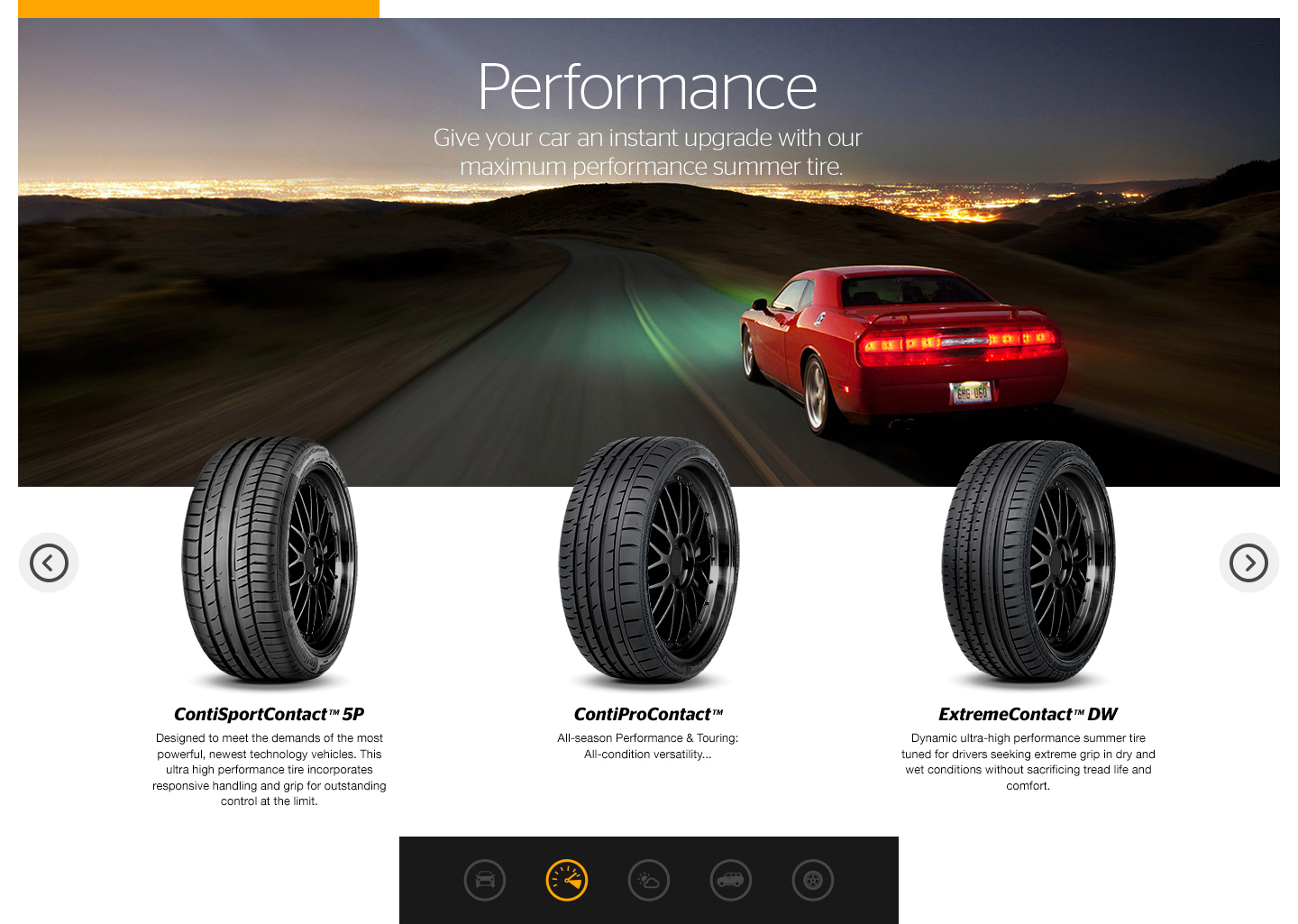
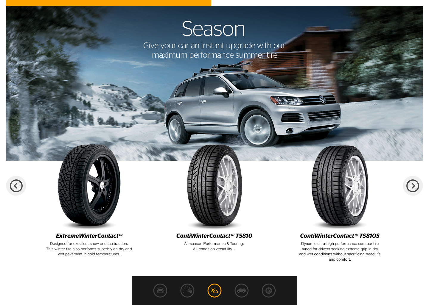
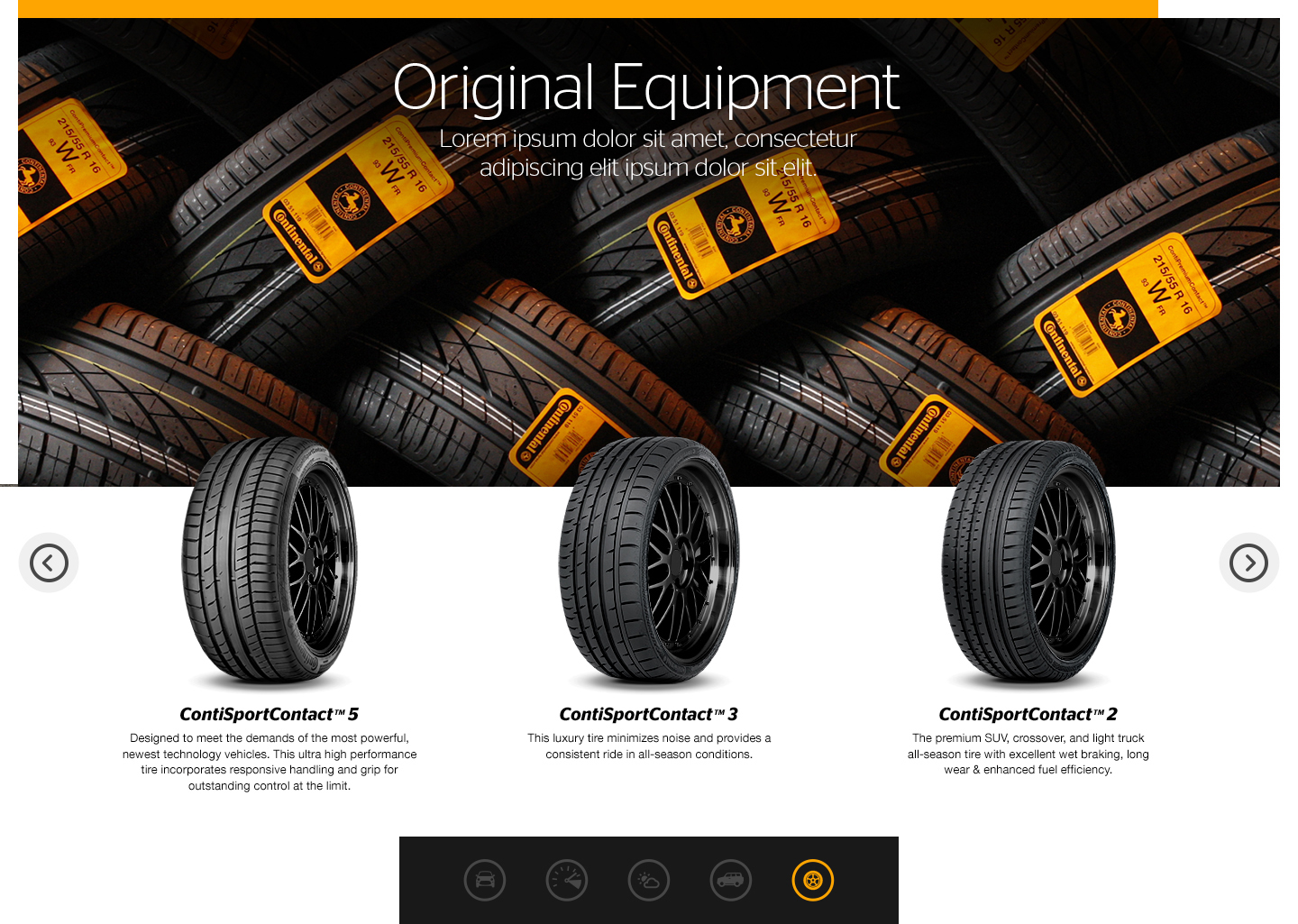
In the middle of the home page, a handy tire carousel was implemented with dual functionality. You could quickly browse between main tire category such as Winter, Passenger Car, Light Truck as well as rotating between all the tires within each category.
Finishing up the home page is a current and featured news section fully customized through the CMS. As I visit the site here and there I always take note that the team frames home page marquee imagery perfectly.
Check out how it works in it’s full glory.
continentaltire.com
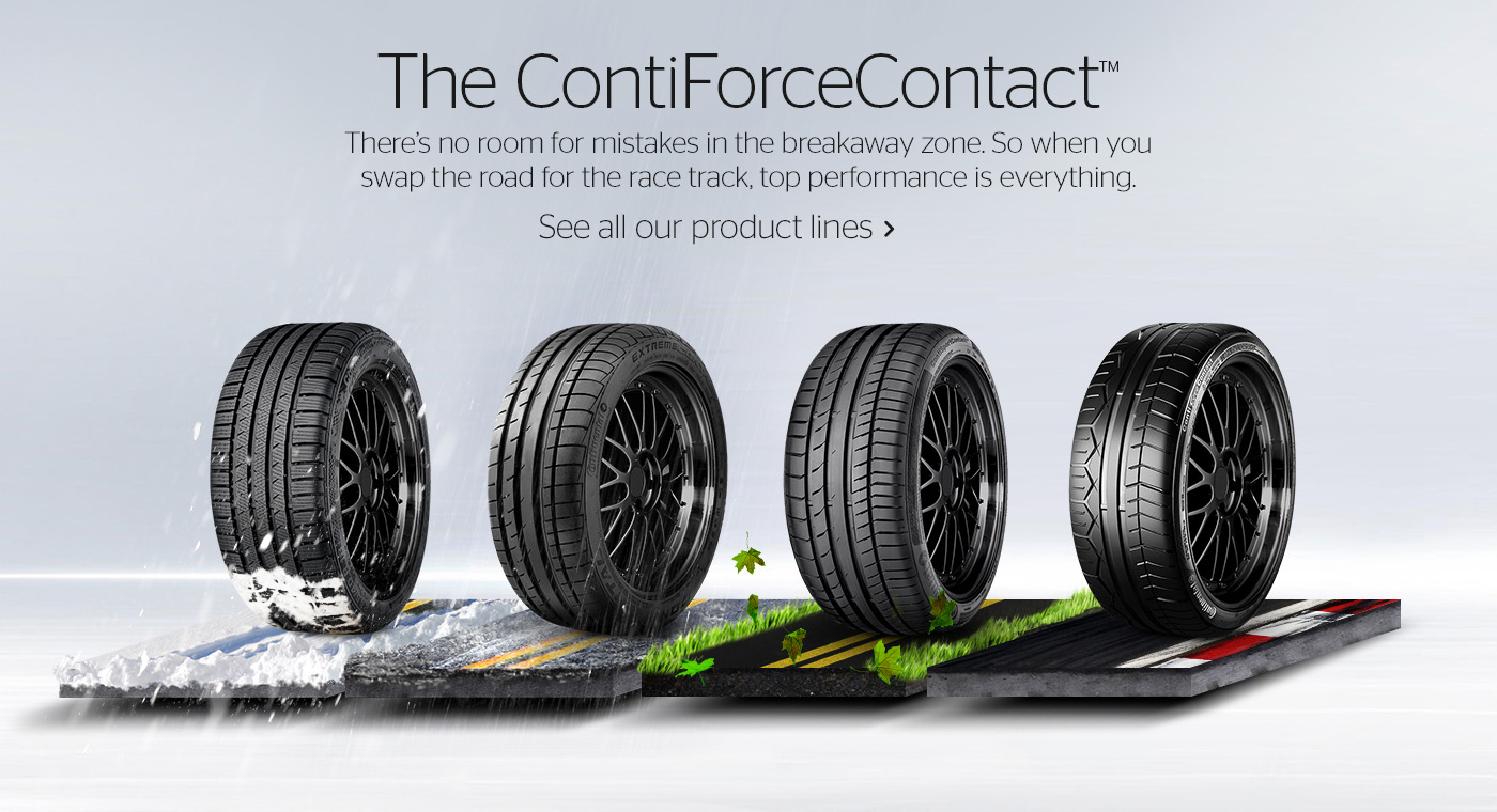
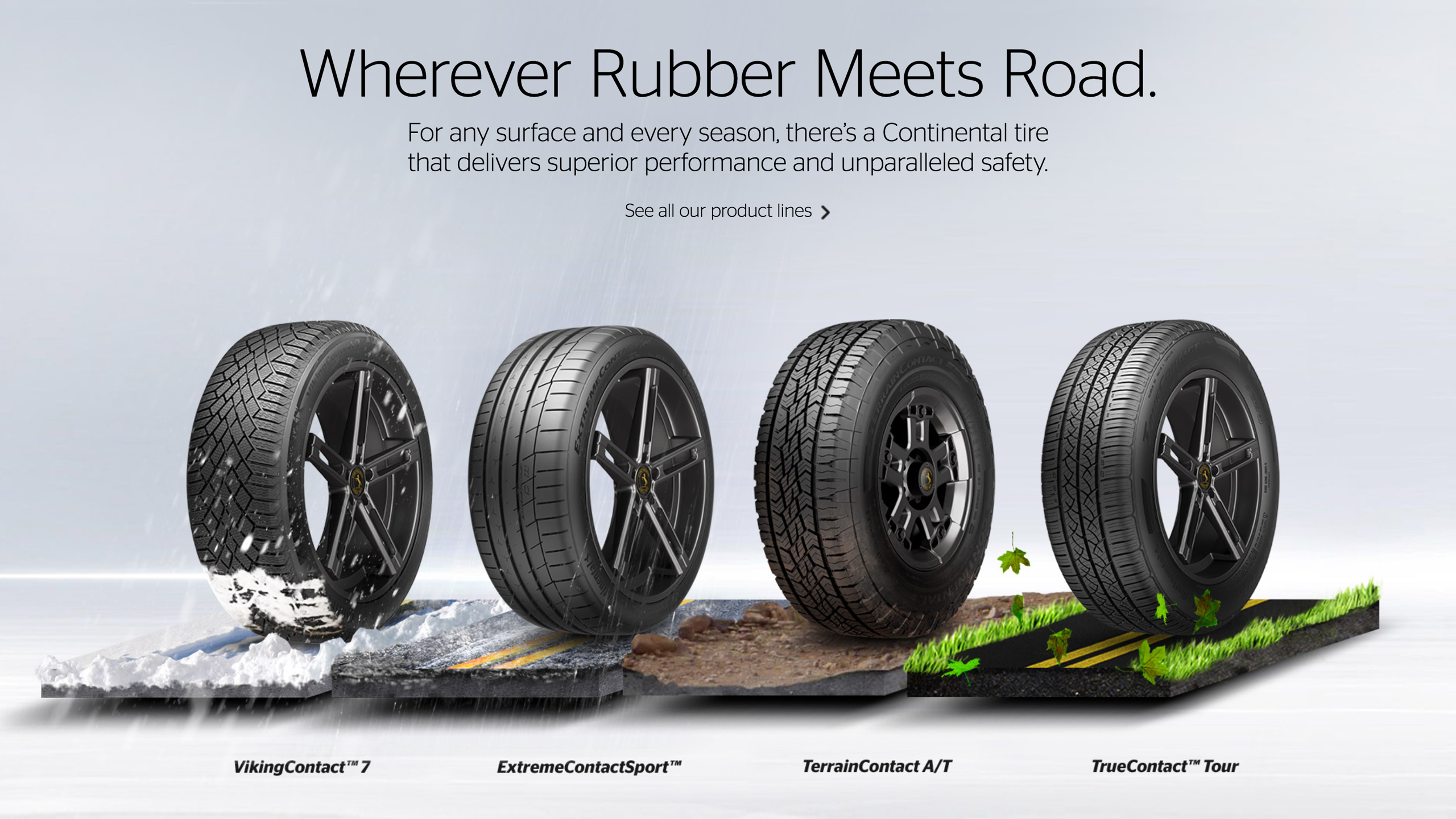
Once a page layout and style was taking form it became evident where the original illustration the client loved was going to live. I spent hour after hour, day after day, hand crafting each one of the visual stories. Summer, Off-road, Rain, Winter and even a Track version for the high end sports car and race car tires Continental are famous for.
This had to be done at high resolution since it could live in print or other larger graphic solutions.
Where rubber meets road
It was so well received, Continental still uses the original illustration on the home page today. The graphic then made it’s way into small info graphics explaining to users just what type of climate or road situation the tire is best suited for. And once again, they still use the same illustrations for the tire detail infographics I created at that time.
Seen below is my original illustration and then underneath, is what it evolved to and is still in use today. Even my headline Where Rubber Meets Road.

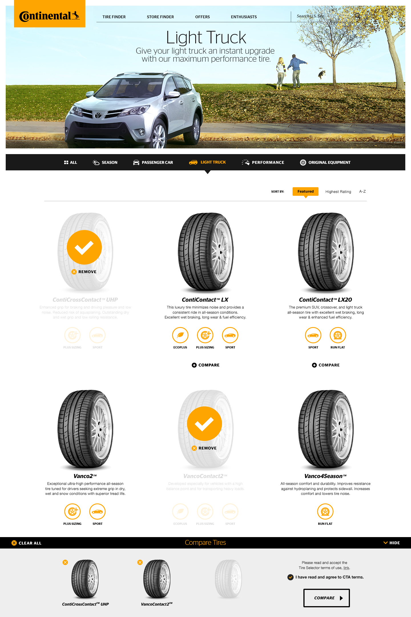
In addition to the tire finder experience, users can browse specific product sections such as Passenger Car, Light Truck and/or Performance. Each section has there own look and feel, all completely customizable through a CMS.
Please scroll through the screens below to get a better sense.
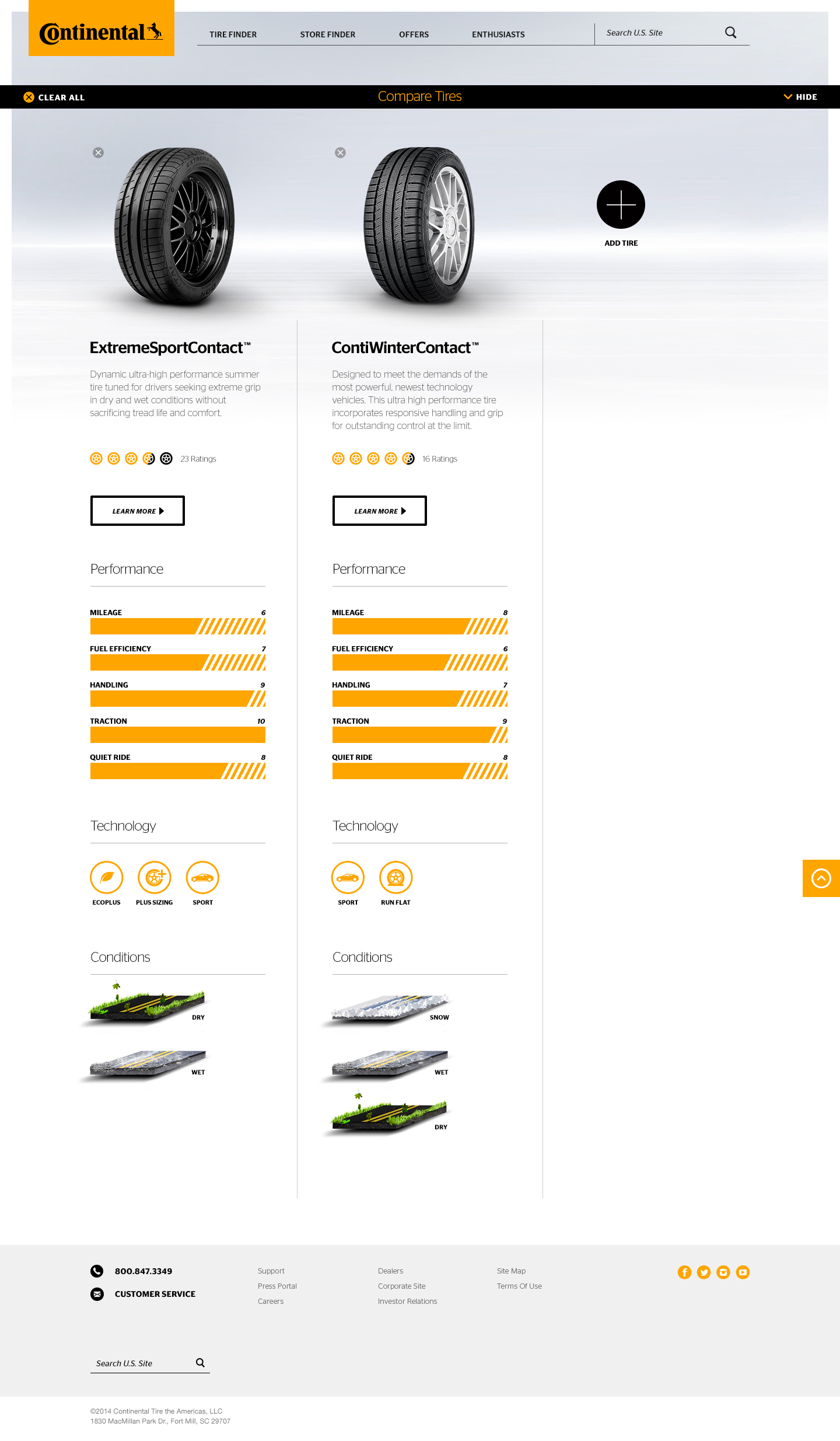
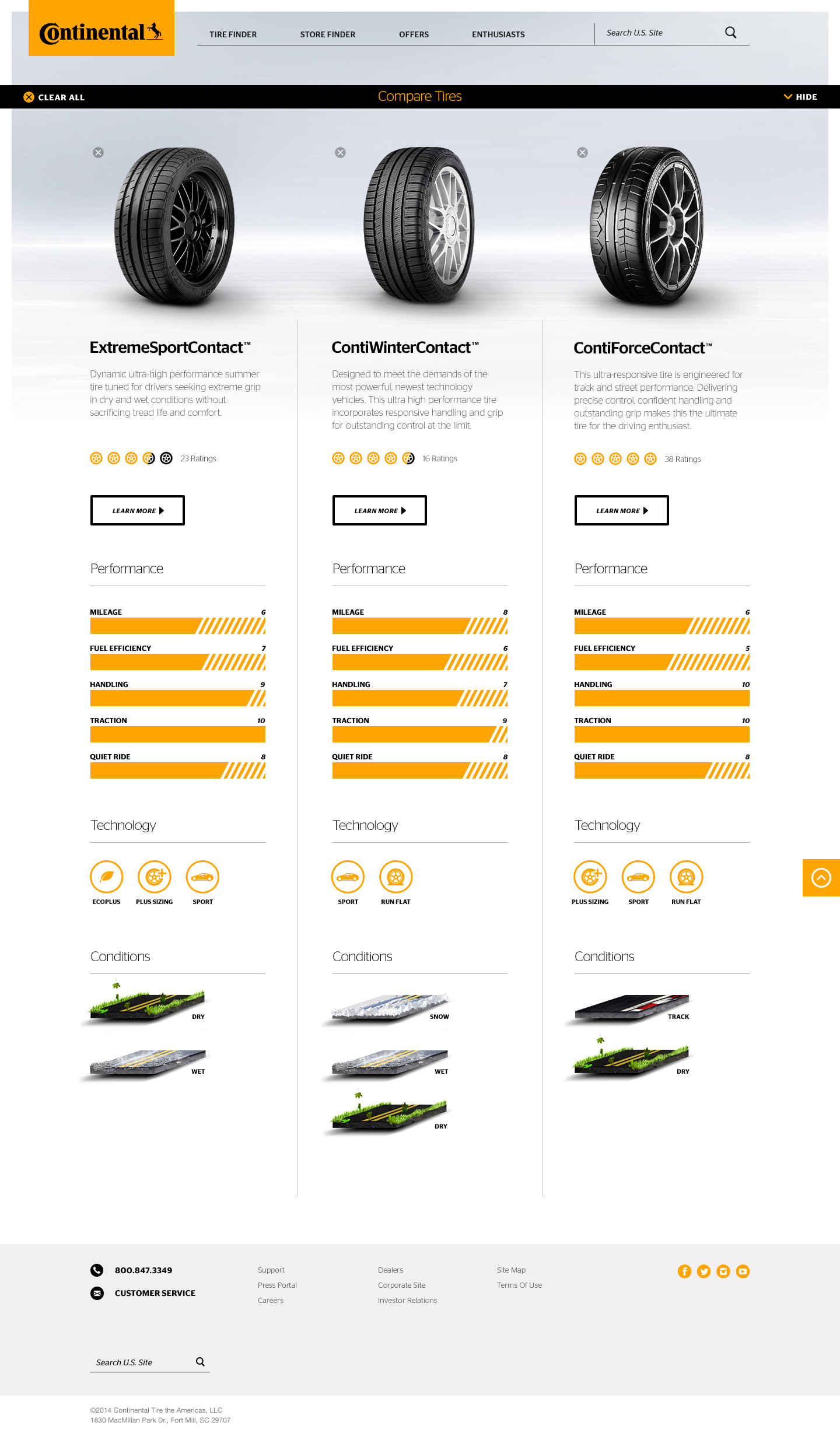
At any time the user may compare up to three tires at a time and get a full detail of each. A custom set of icons that the content manager can select within the CMS were created to give immediate visual cues key aspects of each tire.
Once tires were selected they went into a bucket in a drawer rising up from the bottom screen. From there you are able to jump to the comparison page.

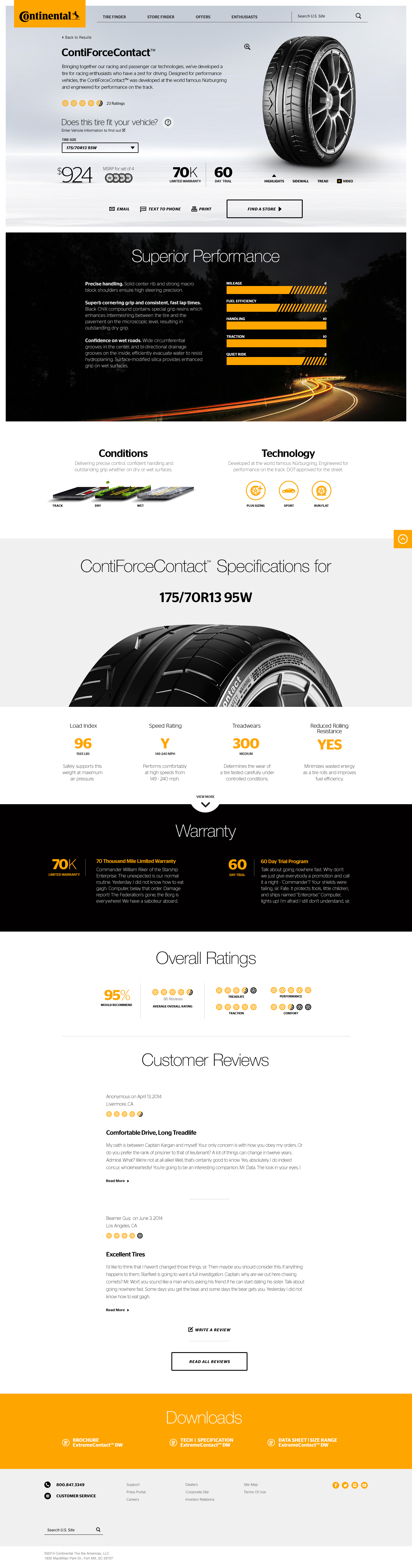
After finding the perfect match to your specific vehicle or after browsing, the user is lead to the product detail page for a comprehensive look at the tire just right for them. This includes specific facts about mileage, fuel efficiency, handling, conditions and technology behind each tire with interesting and clear graphics for the user to see at a glance.
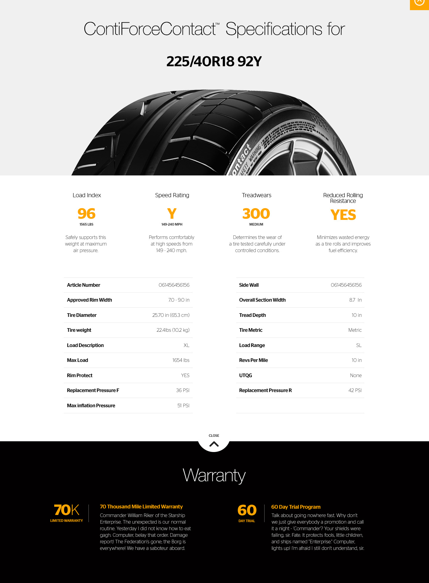
This screen shows the specs and more info in the open position.

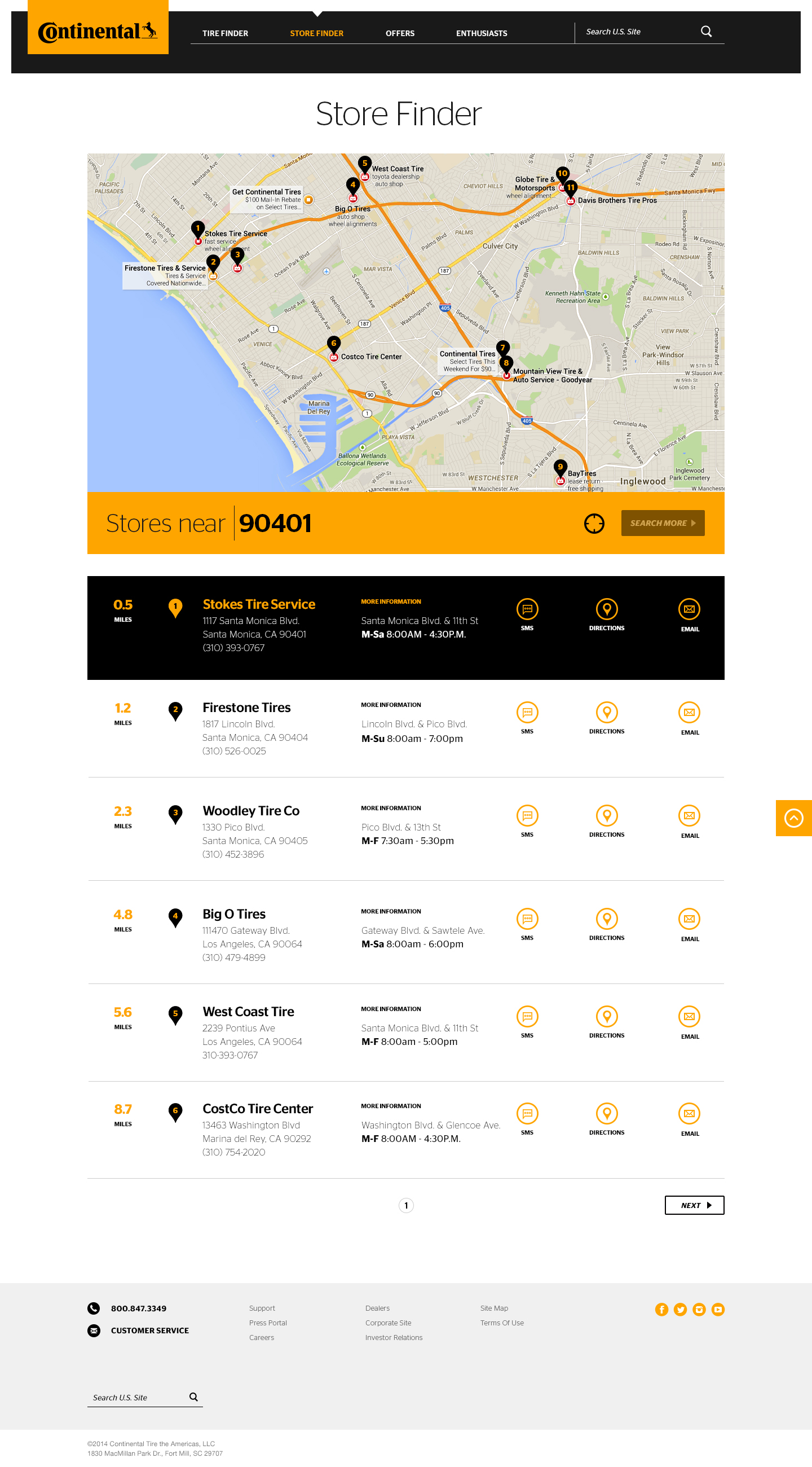
One of the biggest tasks of the project was to develop a system that incorporates dynamic, data driven information based on IP addresses that then displays the users current location and matches them with the nearest Continental Tire dealer.
Studies have shown that from the time you first realize you need a tire—say from a flat or discover wear—to the conversion time in store is less than 6 hours. With that in mind I geared the experience toward mobile users. You can call, email, get directions or send an SMS directly to and/or from your phone for times when you are out on the road and need a tire fast, completely mobile friendly.
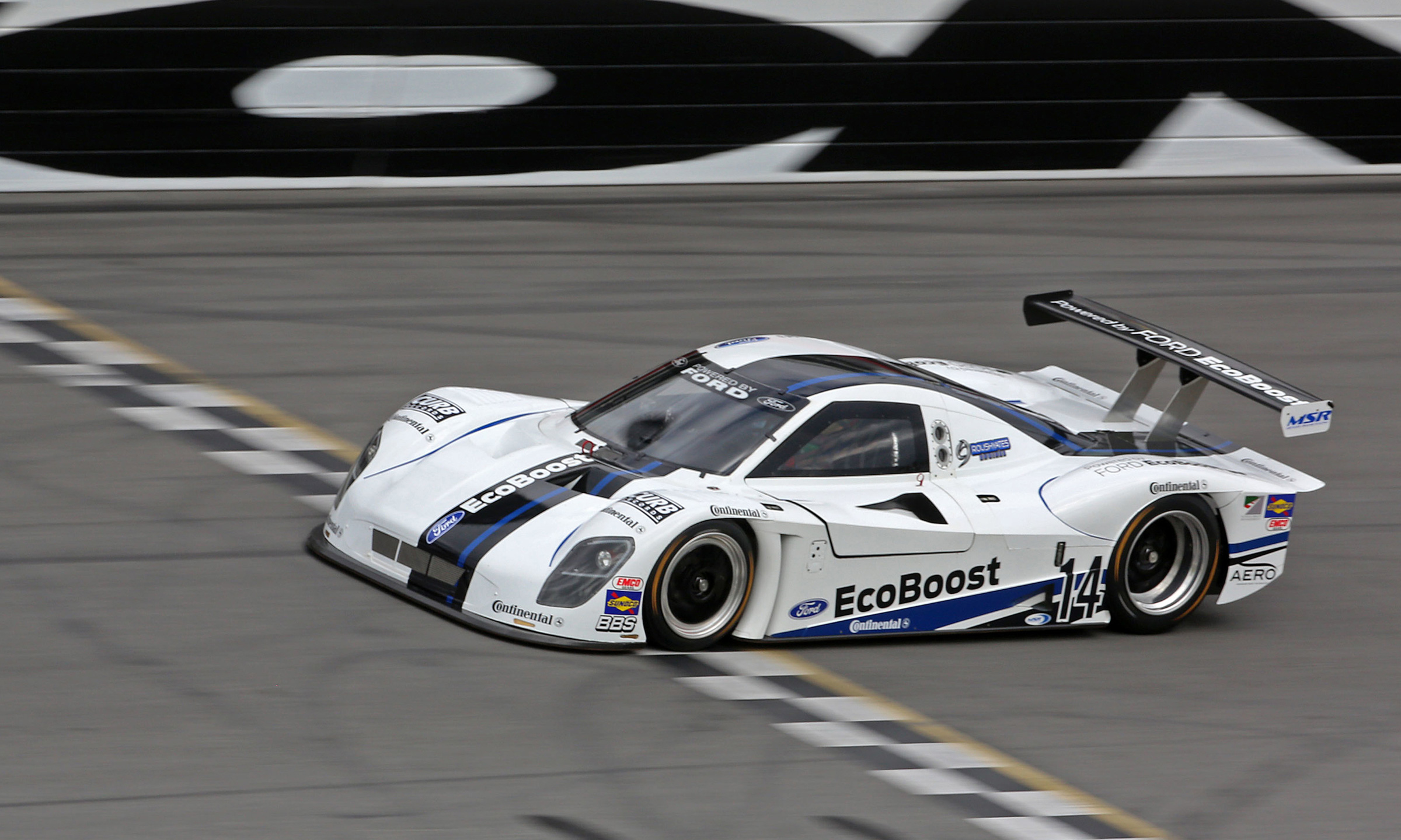
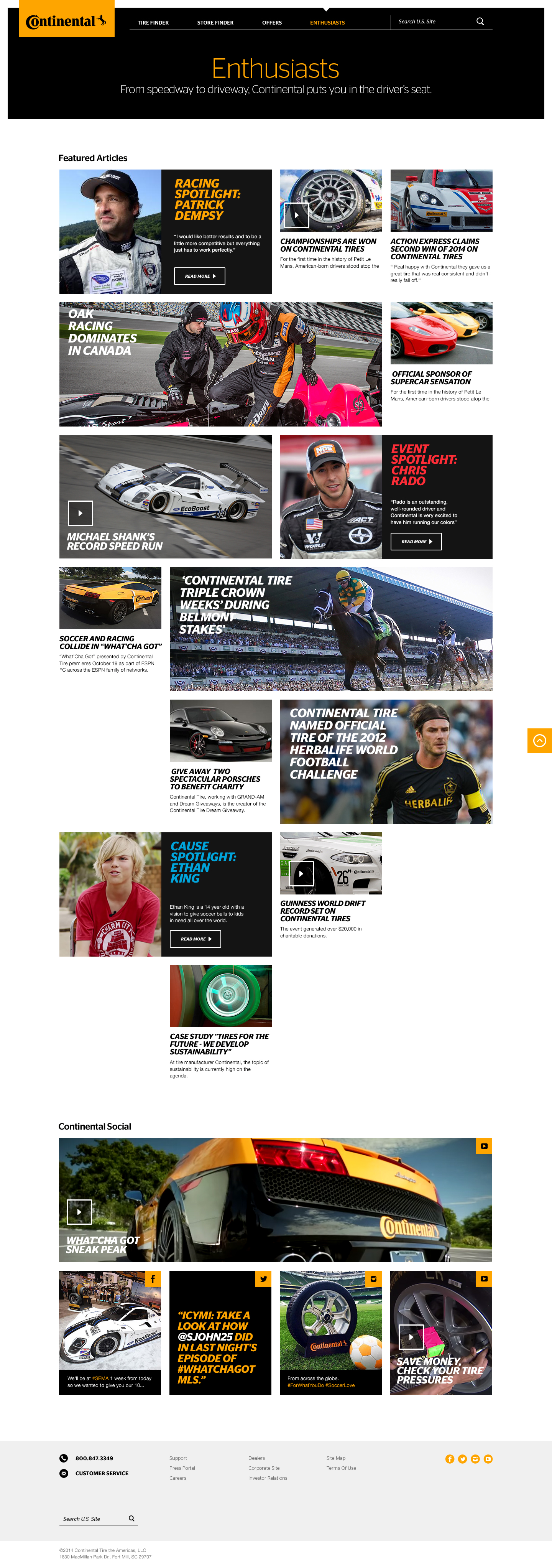
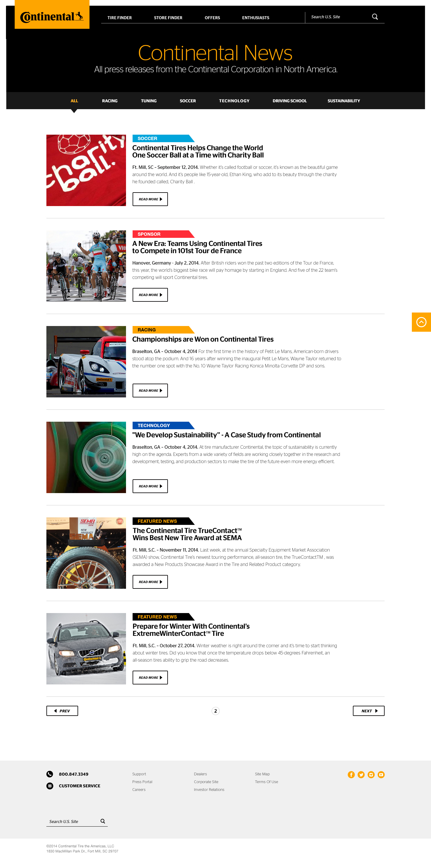
Continental has a long and loyal following and have a presence at many major events such as IMSA races, World Cup Soccer as well as many enthusiast partnerships. We wanted to develop a section just for them, bringing what enthusiasts love the most to the forefront. Below I developed an enthusiast board which is a living breathing section of fresh and relevant content.
Within the custom built CMS in which I lead design, UX and content strategy, the content manager is given the ability to use a long, medium or small article block and the masonry grid does the work to make it flow in a unique way.
Once the site was in development, I continued to work with the team at Continental to help get them on their feet in the realm of content. Once it went live, I managed their content for a period of 6 months while they built out their team. I started to see a trend in my work, a certain growth and something I have later gravitated towards in nearly all my work since.
As an automotive enthusiast, working with Continental was an absolute honor and this project really pushed my boundaries in design and UX. More importantly I think it really pushed my writing and content abilities.
A few key things I learned which I really feel solidified in my later work:
1 / There’s only so much you can do in UX on a white page with grey boxes, denoting what goes here and how this such thing works. Once you get in the comping phase, pure design, go deeper into the problem. The space in front of you, the one with color and imagery will start to tell the true story.
2 / Anytime you can put real imagery and content into your comps it will pay off in spades, and it’s really not much more work.
3 / A lot of the headlines you see in these comps were my writing as I tend to write actual headlines and subheads and find relevant copy when showing comps to clients. Writing real headlines gives the client a much better sense of how their project is going to live, they can relate to it, and most importantly, they will sign off on it. It also helps to set up context with the imagery and story you are trying to tell. And yes, you should be telling stories through your design.
Funny story, in one of my early comps to our client I had a passage of lorem ipsum in one of the copy blocks and being a good catholic, my client responded, “what is this blasphemous stuff I'm reading?”, “I can read latin from my catholic school days and it’s talking about something like pleasure and pain!”
I was amazed he could read it but intrigued by it’s offensiveness. Lorem ipsum it turns out is from a passage of the book The Extremes of Good and Evil by Cicero, written in 45 BC. I’m not sure I can repeat here what some of the standard passages mean so I’ll just leave it at that.
We had a good laugh.
Results /
Over the course of 6 years since it's launch, millions of users have visited this site and used it's tools with success as the site has not changed much since I finished the project.
In fact some of the imagery and the illustration of the four tires on the home page are still in use to this day. What an honor and testament to my work and the work of all the teammates I worked with at Blitz.
Tire reviews up /
Customer generated reviews and tire ratings increased greatly.
Friendly competition /
There was one more aspect to this project. We had to complete it in just three to four months to beat Continental HQ in Germany to the punch.
We finished ahead of time.
Design adoption /
Continental HQ in Germany adopted many design cues and they can be seen everywhere, even in the bicycle tire business unit.