At Meta I lead a corporate rebranding development including marketing websites and packaging. Then, I joined in the effort to create user experiences for the world's first augmented reality spatial environment.
Summary /
As I leaped on board to join Meta in that April of 2016 the only thing the company had was this really cool logo which was seemly made out of light in motion. That's it.
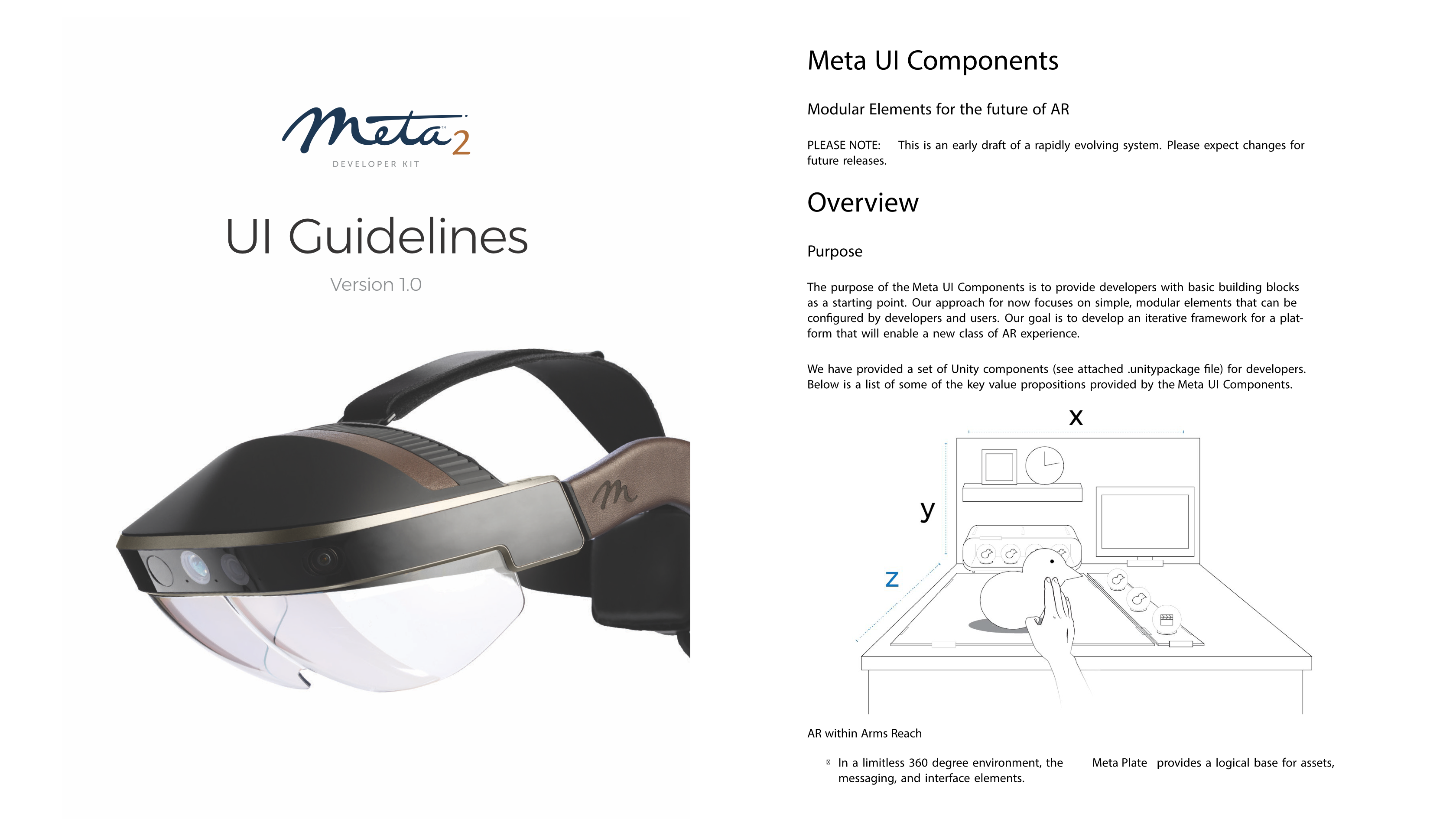
From there I was charged with creating an entire brand from logo recreation, updating and tightening up, photography, a color palette, typography exercise and packaging for the soon-to-be launch of the Meta 2 AR headset.
The challenge /
By this time Meta had been on the block in semi-stealth mode for around two years. They were only heard of through their well known TED Talk. My challenge was to create a brand that would rival any consumer electronics brand out in the market today, to create an air of thought leadership in the AR space and inspire developers, and enterprise professionals around to world to jump on board with our unique vision.
Insights/ The market was ripe for an augmented reality experience and with Microsoft's Hololens out in high end consumer hands but lacking in depth and Magic Leap on the verge of a launch but entirely unknown what was in store, I felt we had a 6 month window to strike. With the company ethos centered around the mixing of technology with a grounded, nature sensibility, mixing light with natural materials was the way to set Meta apart from the rest.
Solution /
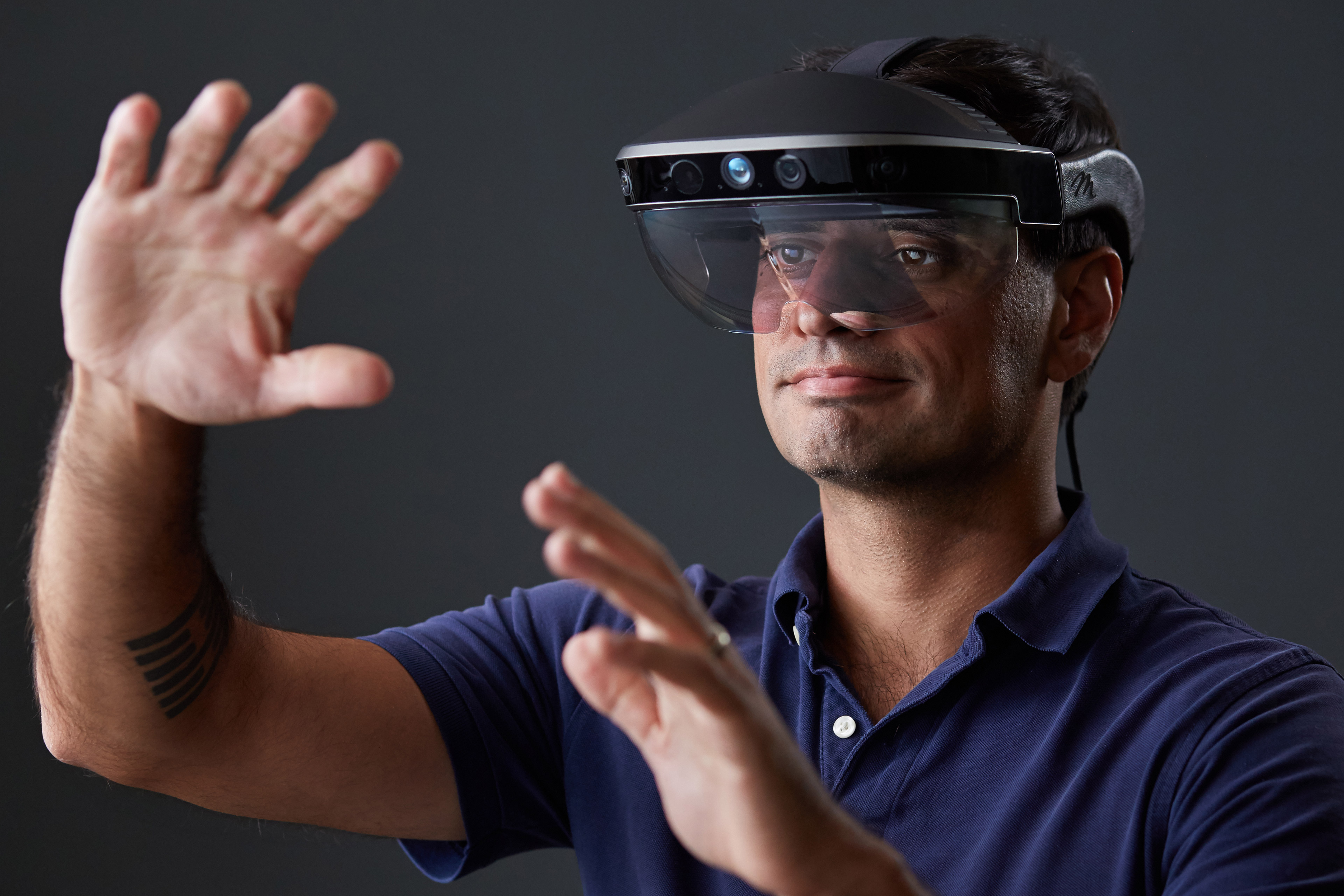
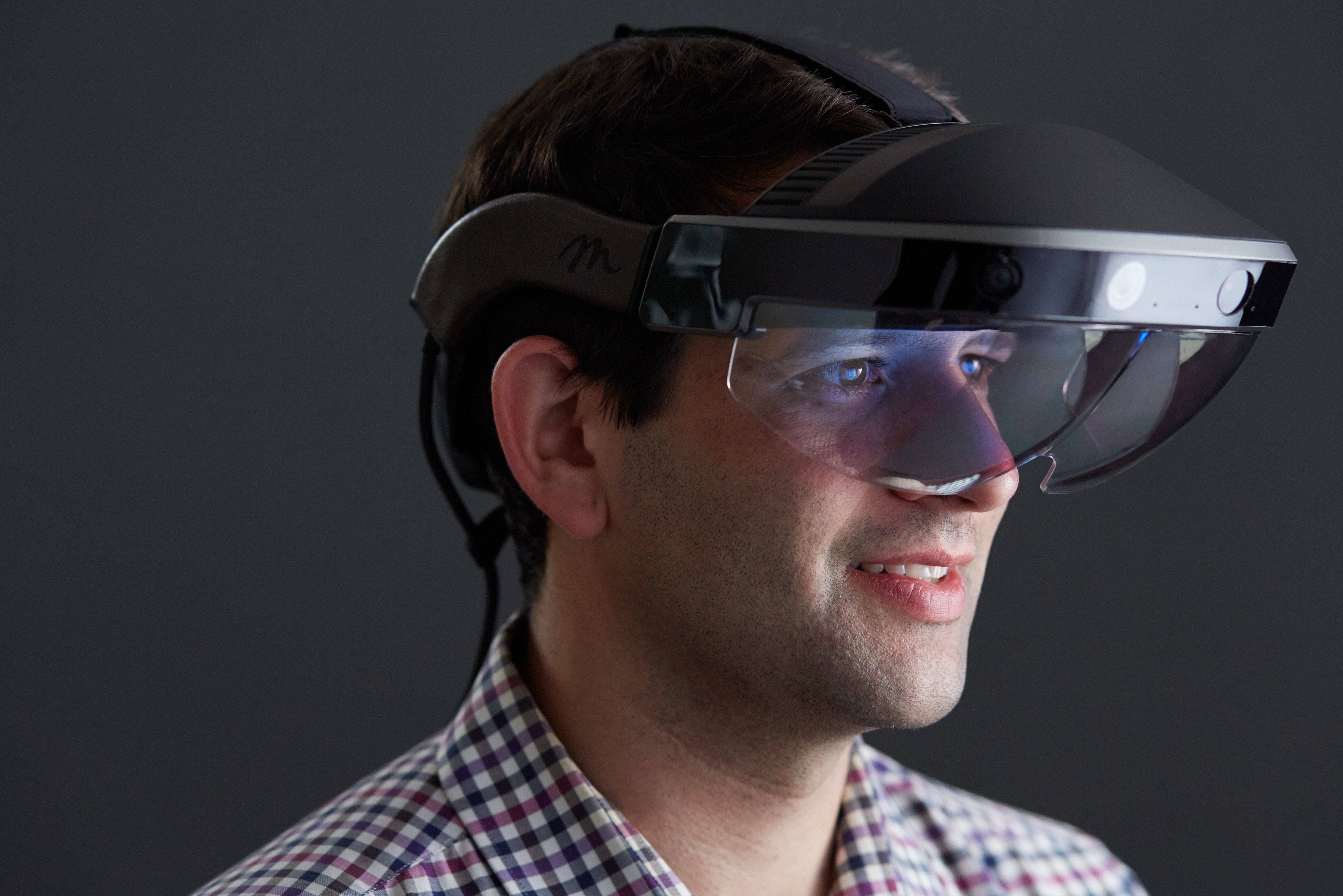
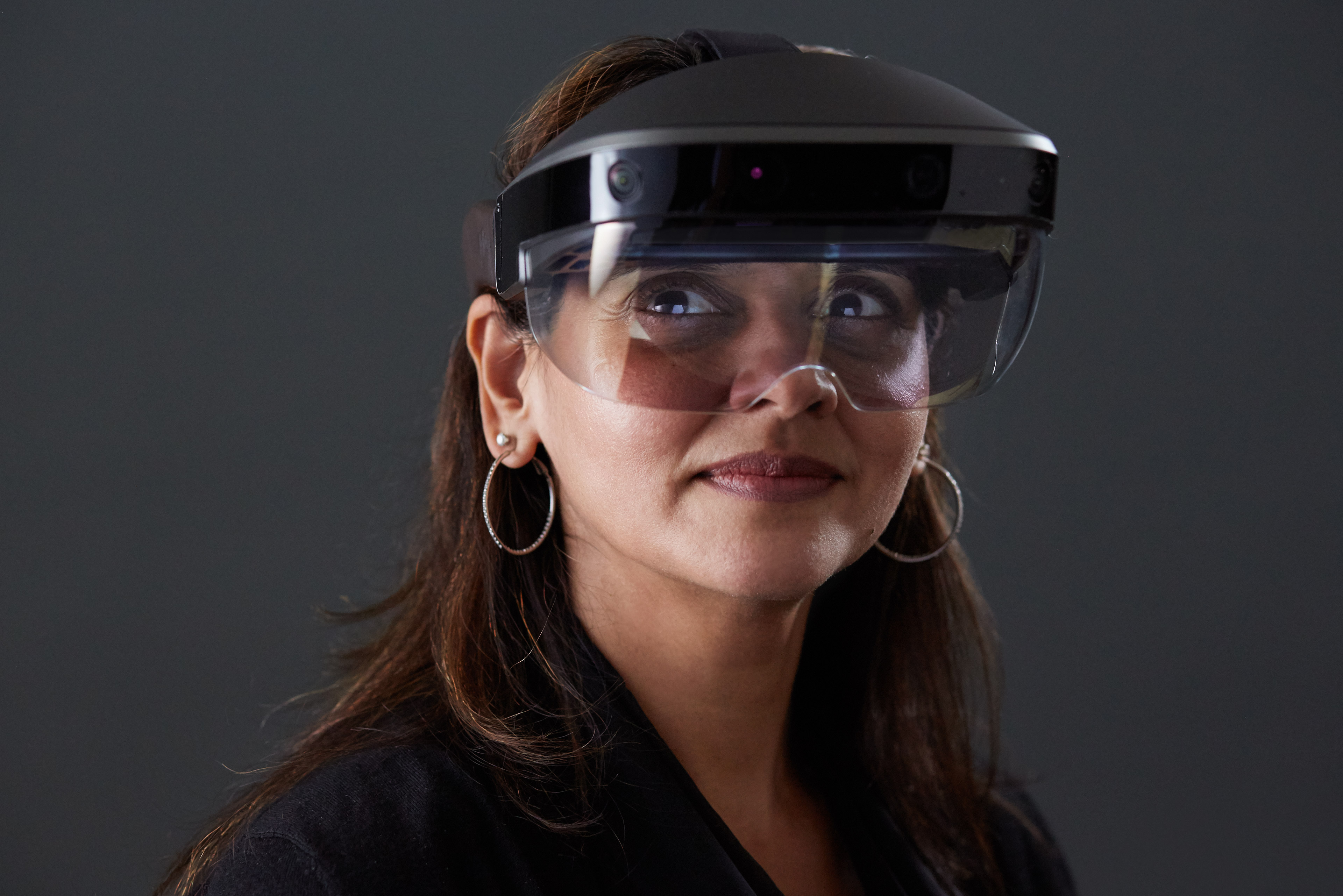
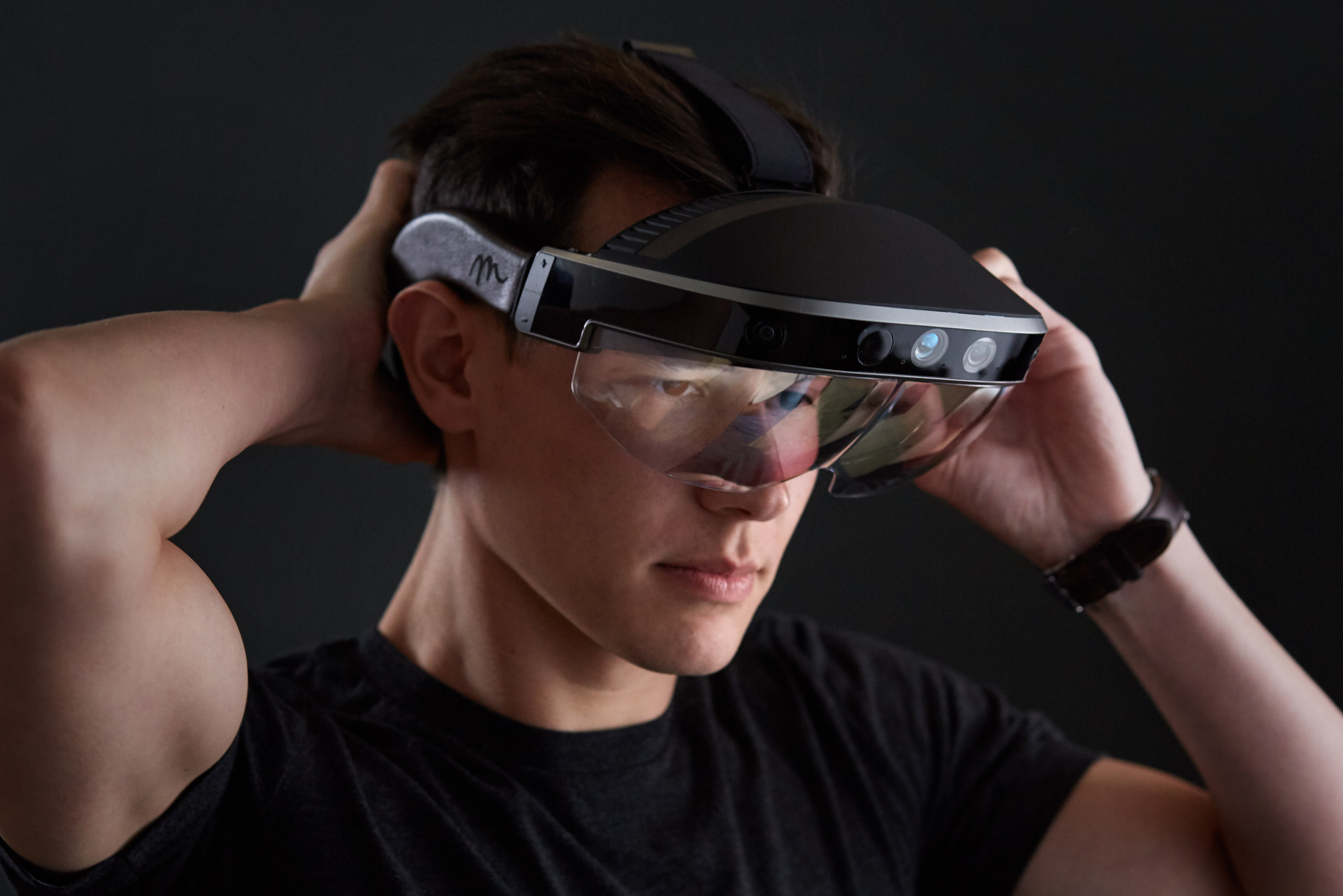
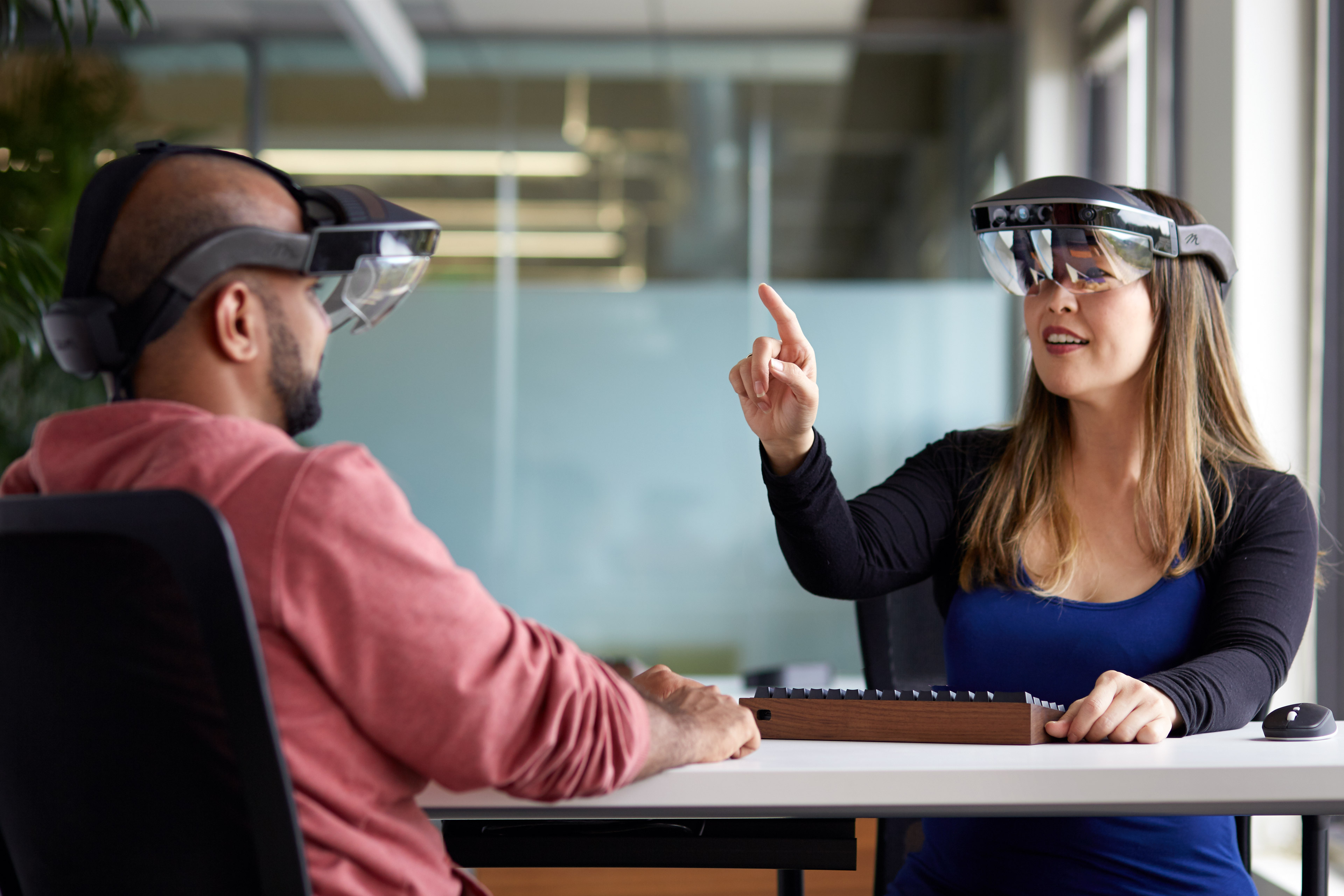
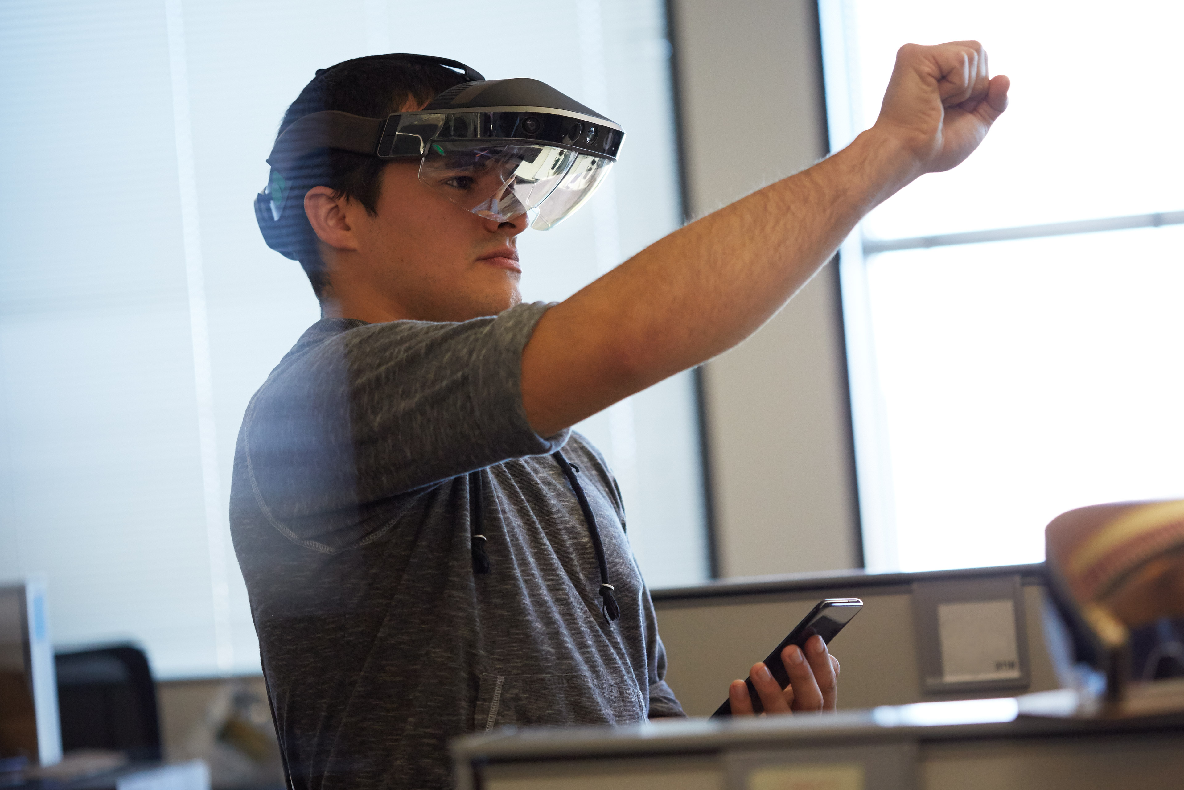
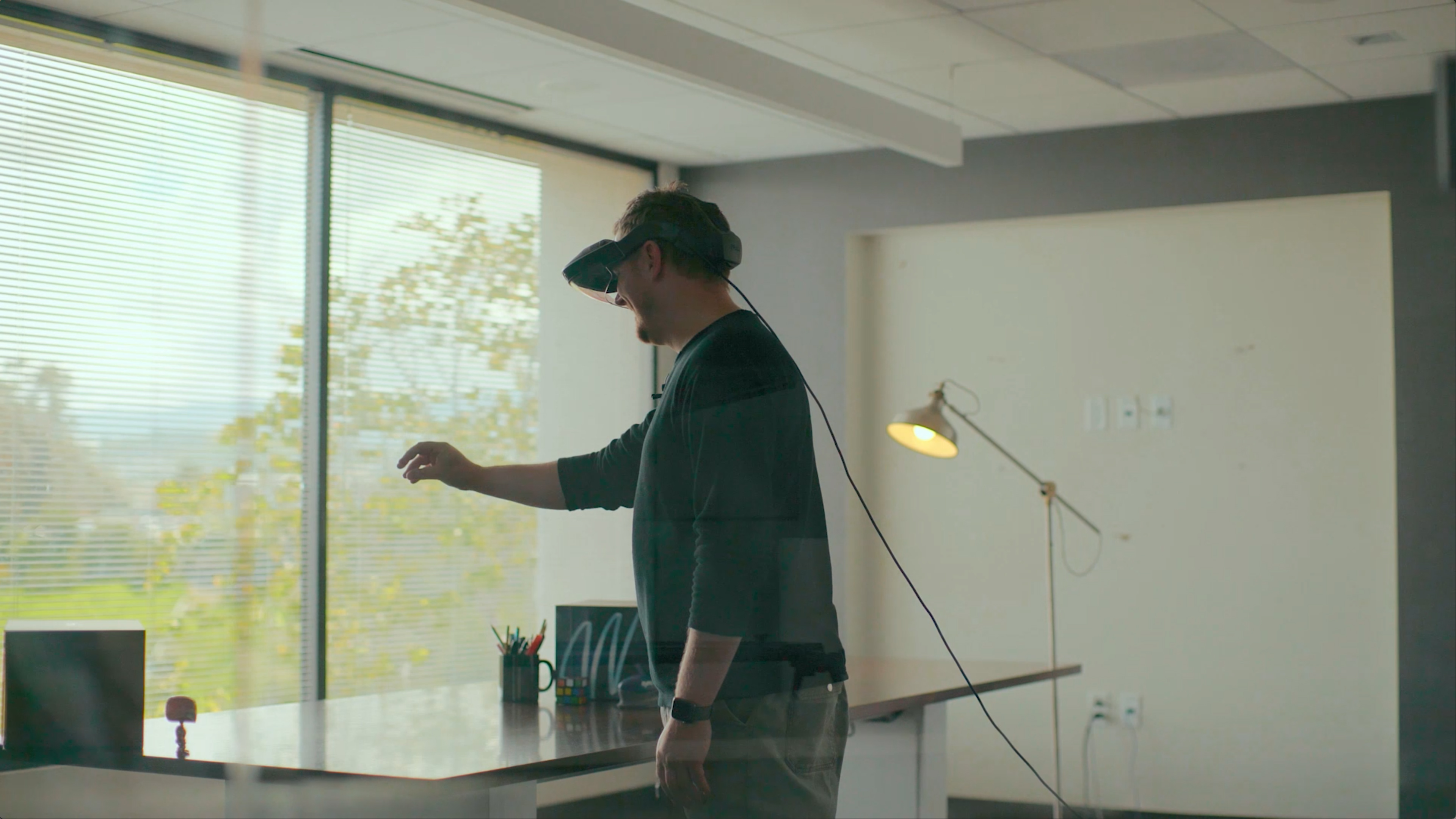
Everyday people using the Meta 2 in everyday situations, focusing on the office of the future type settings, mixing a splash of holograms to give the viewer a better sense of what they would experience within the headset. This was a deliberate decision to elicit an emotional response, setting us apart from the pack.
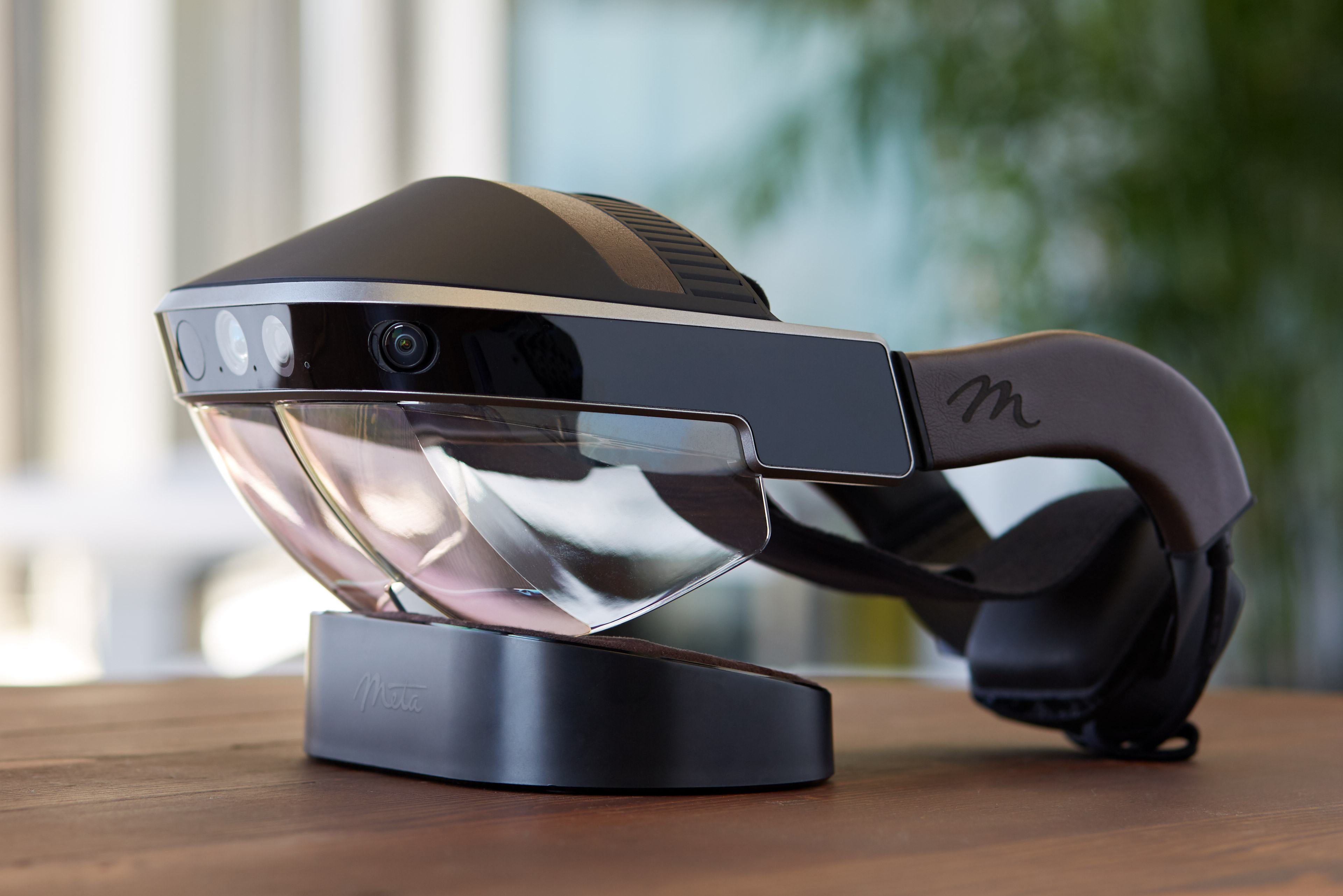
Initial brand development Bouncing off the foundation established, I set forth to create an authentic photographic style. Mixing that with up close style shots on dark bokeh type backgrounds helped to showcase the headset's features. Adding a touch of delight and surprise from our models, everyday Meta employees from the design team, to engineering, and those who gave support to the company. Again to solidify the authenticity of the brand and to create a certain emotion in the eyes to tell the story. And I literally recruited my wife—a natural talent in front of the camera—who became the defacto, face of Meta.
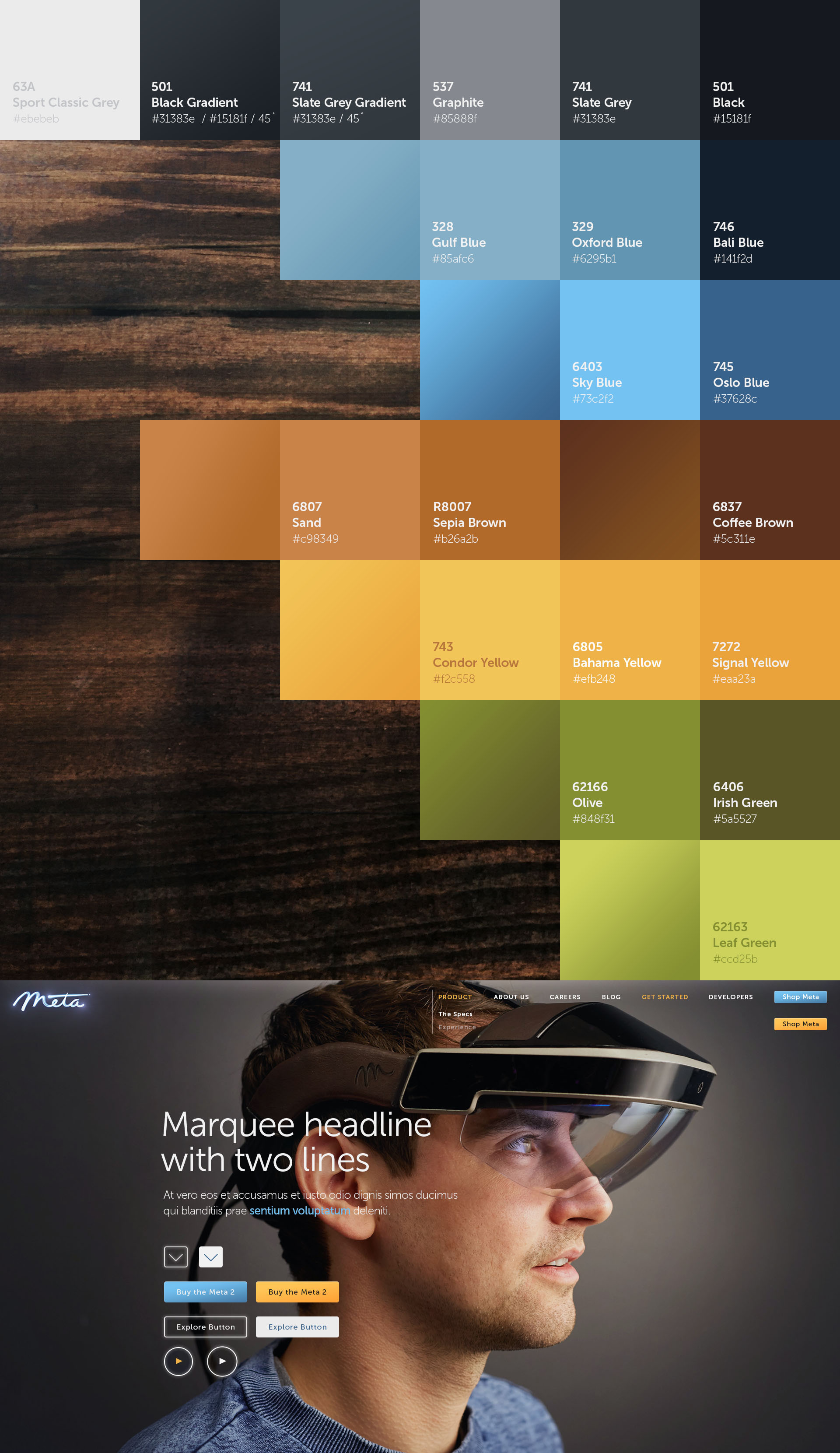
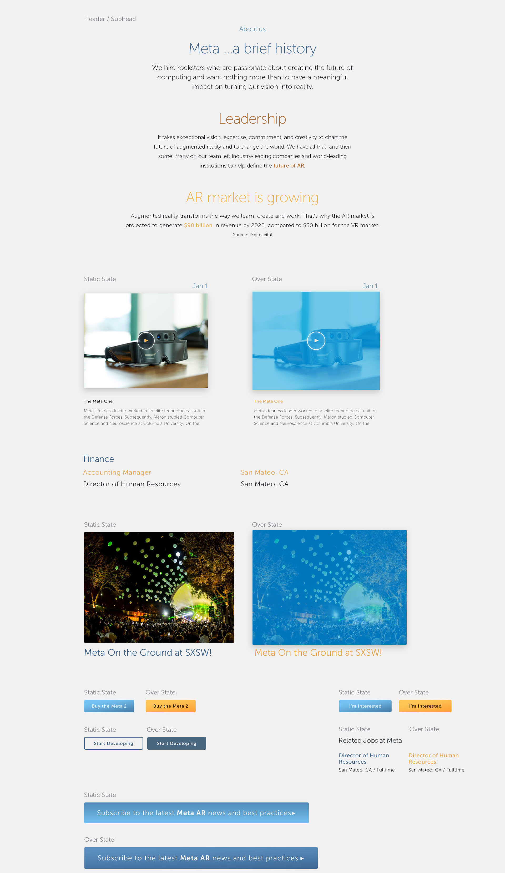
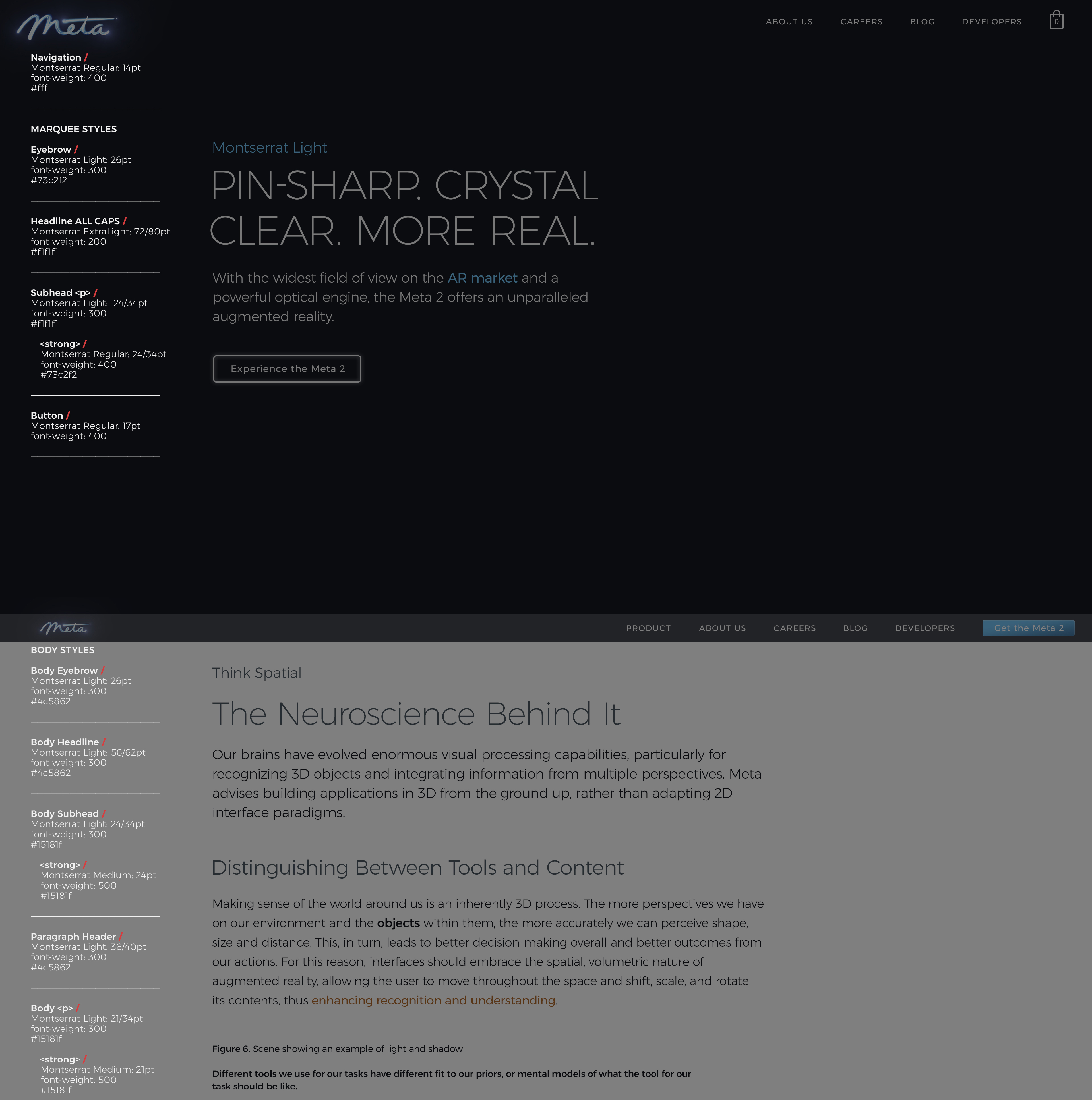
A color palette reminiscent of a sunny Northern California day I then set out to establish a color palette of sky blues with flora type greens and earthy warm tones of yellow to rich brown gradients. This complimented the rich authentic photography and brought the headset forward. And finally a set of typography standards such as eyebrows (those little pieces of type I like to use for section or category reminders, page hints), headline and subhead lockups with body copy styles.
Typography study After living with the brand for about a year and driving the product headlong forward, it was time for a serious typography study. To start, I decided to go straight to Google Fonts. chiefly to have a font that would work anywhere and especially in our online presentations built on the platform.
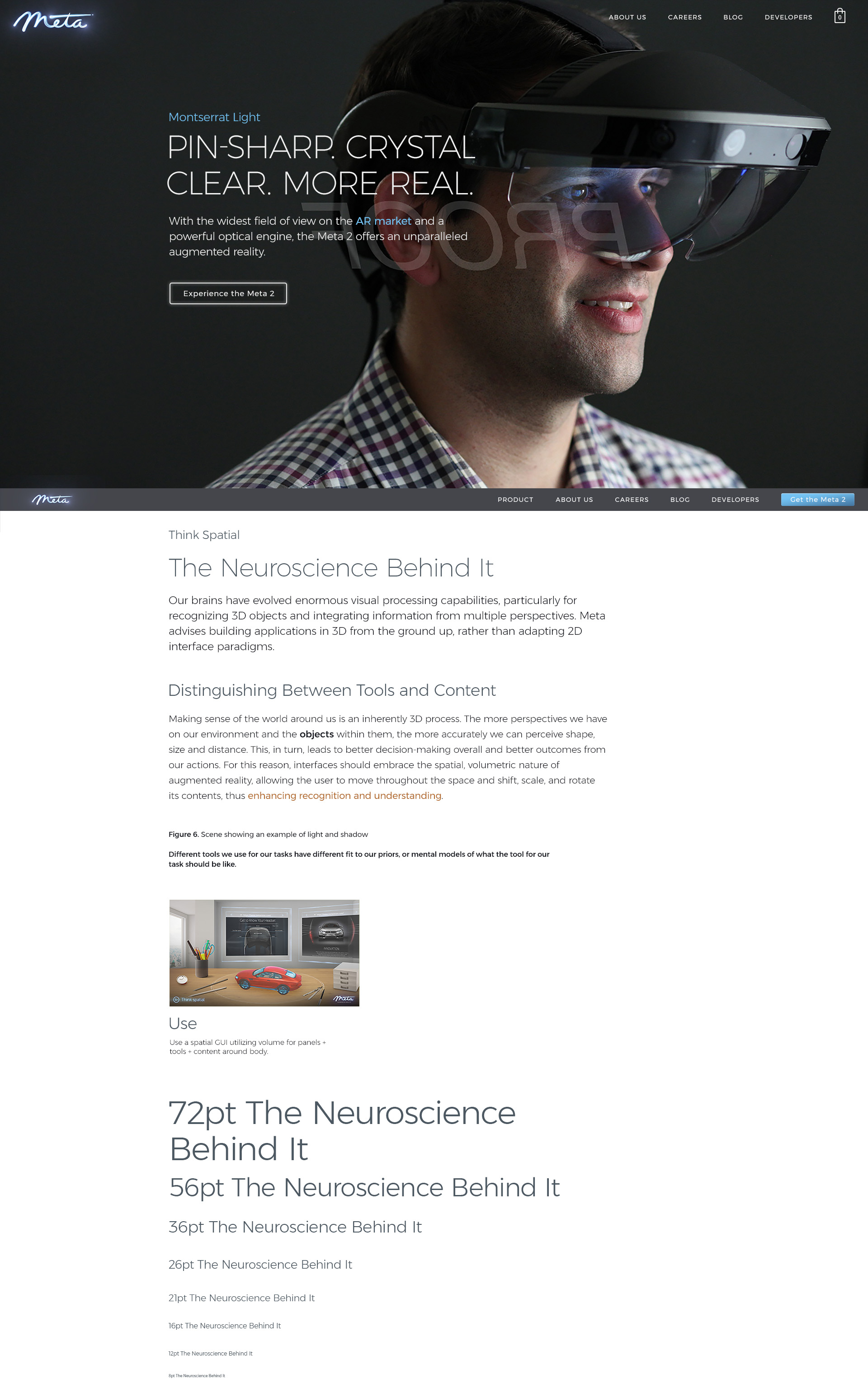
After a few weeks of looking at dozens of combinations, headlines, subheads and body copy pairings I settled on the Montserrat family. Incidentally, it's the family you are reading right now. I love it that much.
Three main criteria made the decision for me.
1/ It's a family and I needed at least 5 different weights for various things such as headlines, body copy, captions, bylines, quotes, etc... 2/ It had to be crisp at a small size. Montserrat looks amazingly crisp and very readable at 8pt. and 3/ It had to look and read really well inside the headset.
I spent several days with a brilliant intern from Stanford, Rosemary Le—who just happened to be a neuroscientist—testing subjects from around the office and focus groups to find the perfect readability in depth. See, when viewing type in an AR or VR setting, you are viewing it in space so it has to hold together in various "distances" as the brain will fool you to believing it is living in space just as any sign in the physical world would be at different depths to our eyes and cognitive understanding as we approach those objects. Yes, a little heady there.
With that I was able to move forward and evolve the brand further. I then retooled everything, from the corporate literature to the website and interface standards.
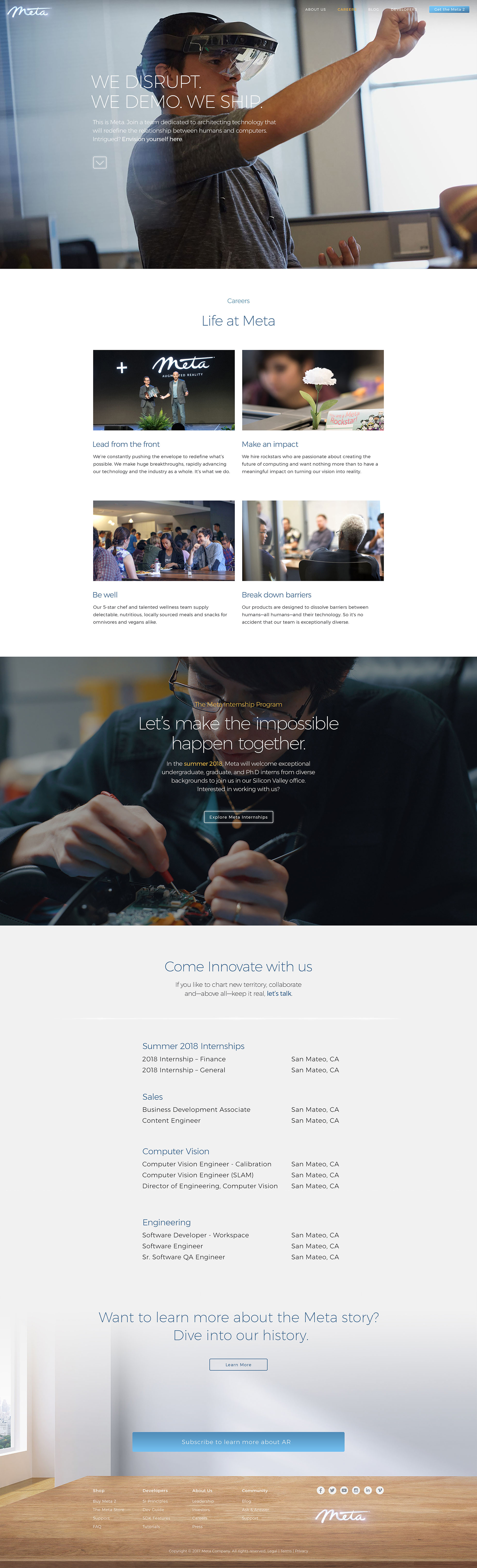
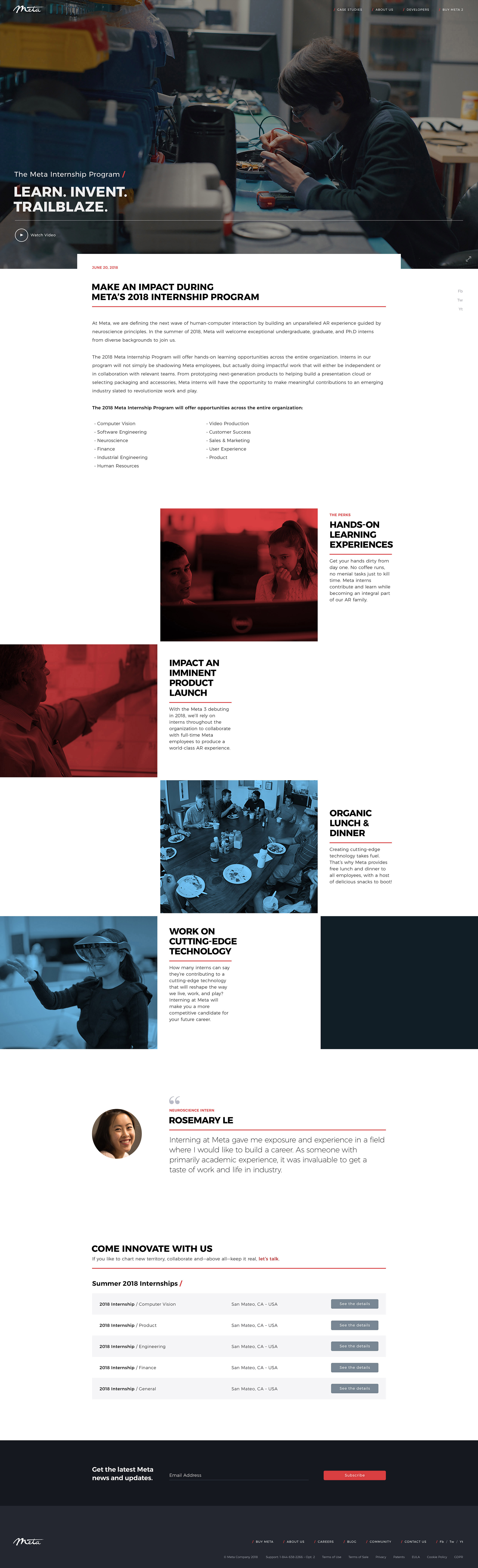
The evolution of the Meta marketing website /
Putting all that ground work into practice, I tackled the company website and eCommerce platform. Mind you, a lot of this work was going on concurrently so to say I was busy that year, is an understatement.
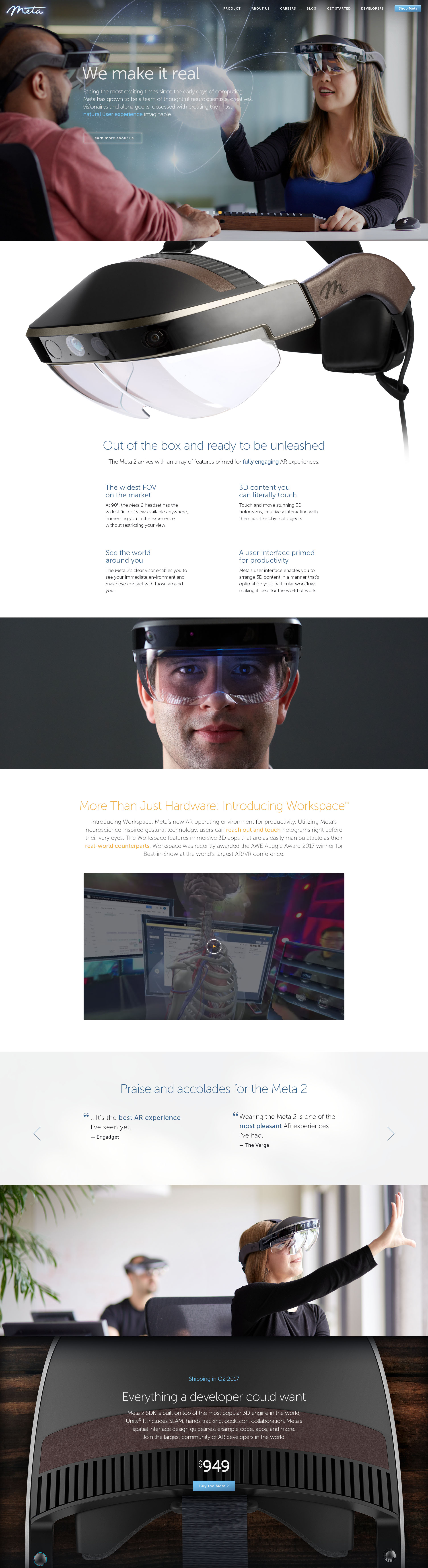
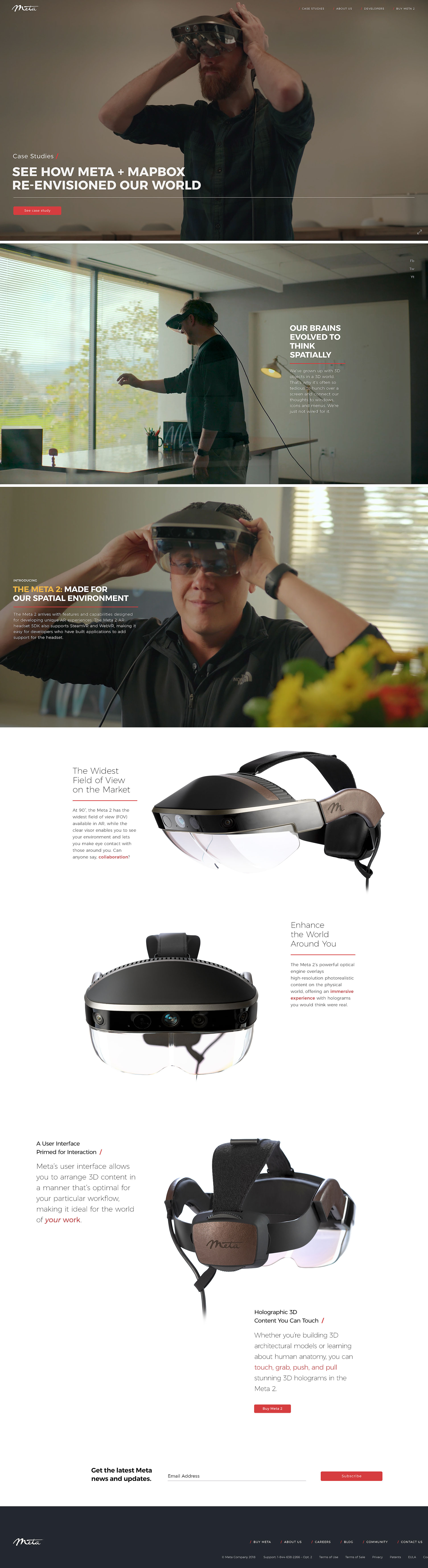
Below you can see how the first launch of the Meta marketing site on the left, came to be. On the right is an evolutionary step as we were approaching Meta 3 territory. Sadly I was not able to see this to fruition before the company shifted gears as it did but in true fashion, I put a full effort into making a sophisticated product, even more sophisticated. On the right, you'll notice I started taking some cues from the spatial interface "plate" concept I developed—as you see below—in the marquee headlines in order to bring continuity of brand in and out of the headset.
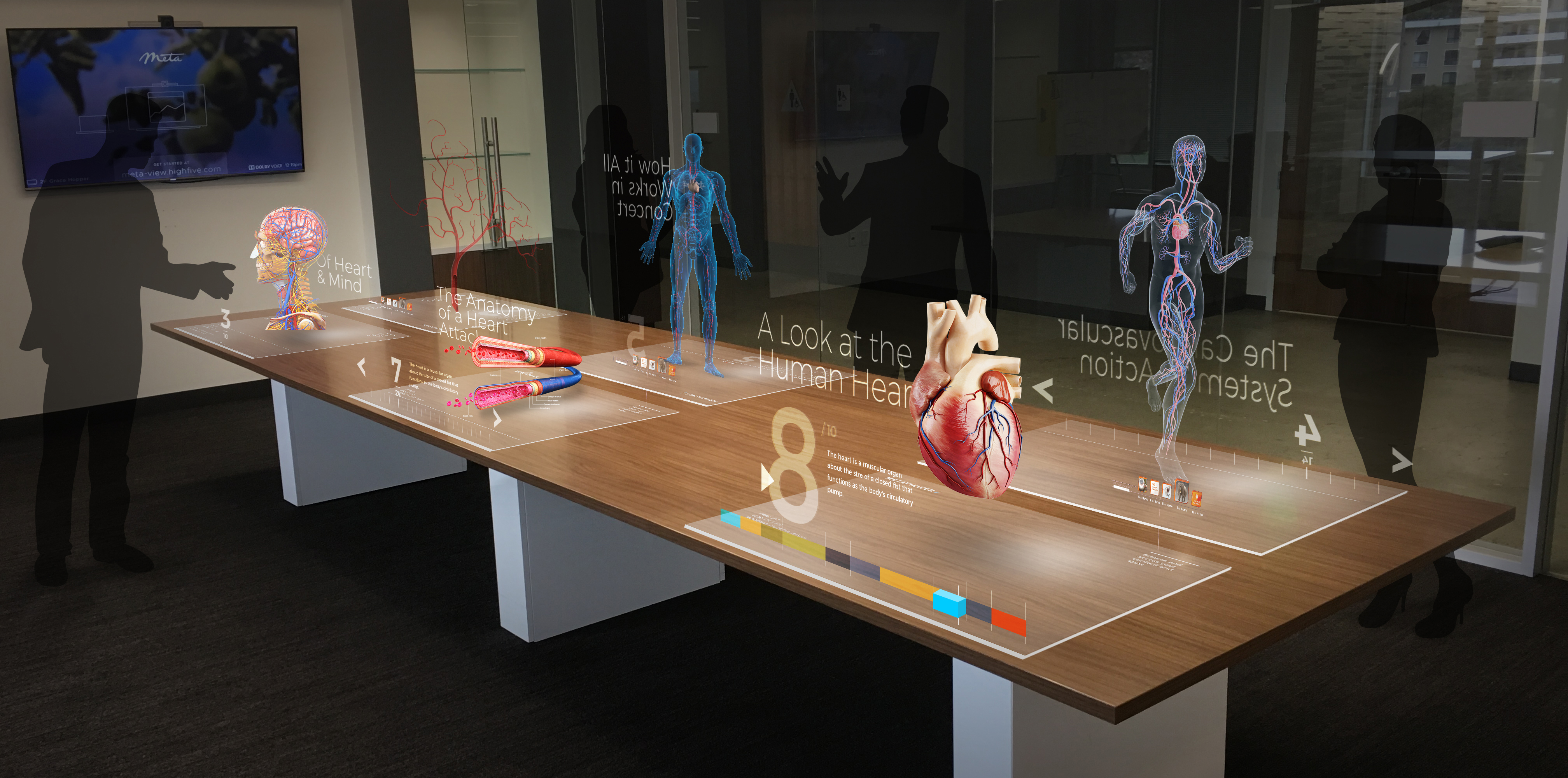
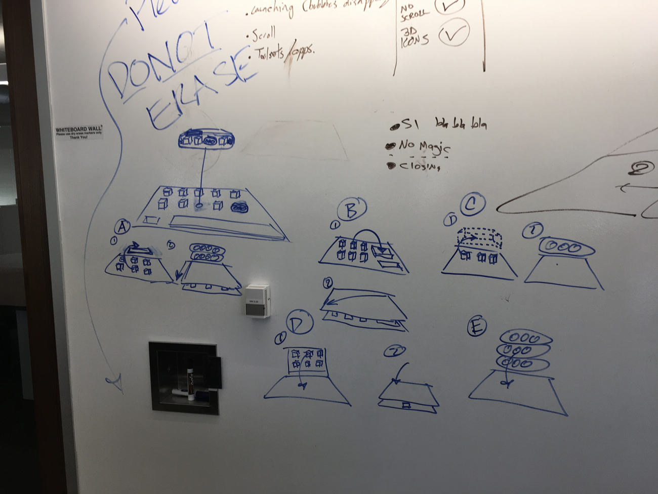
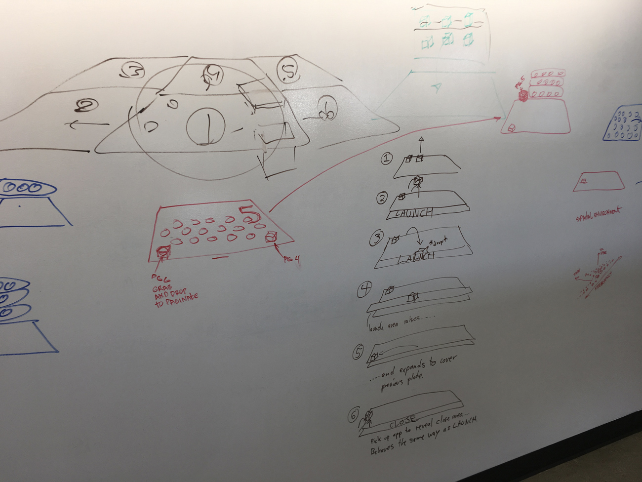
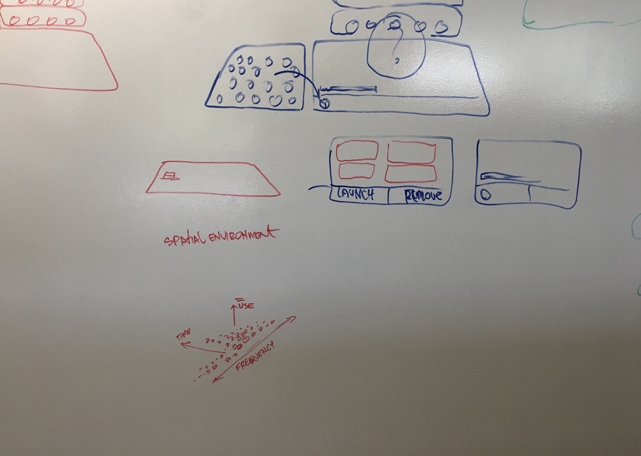
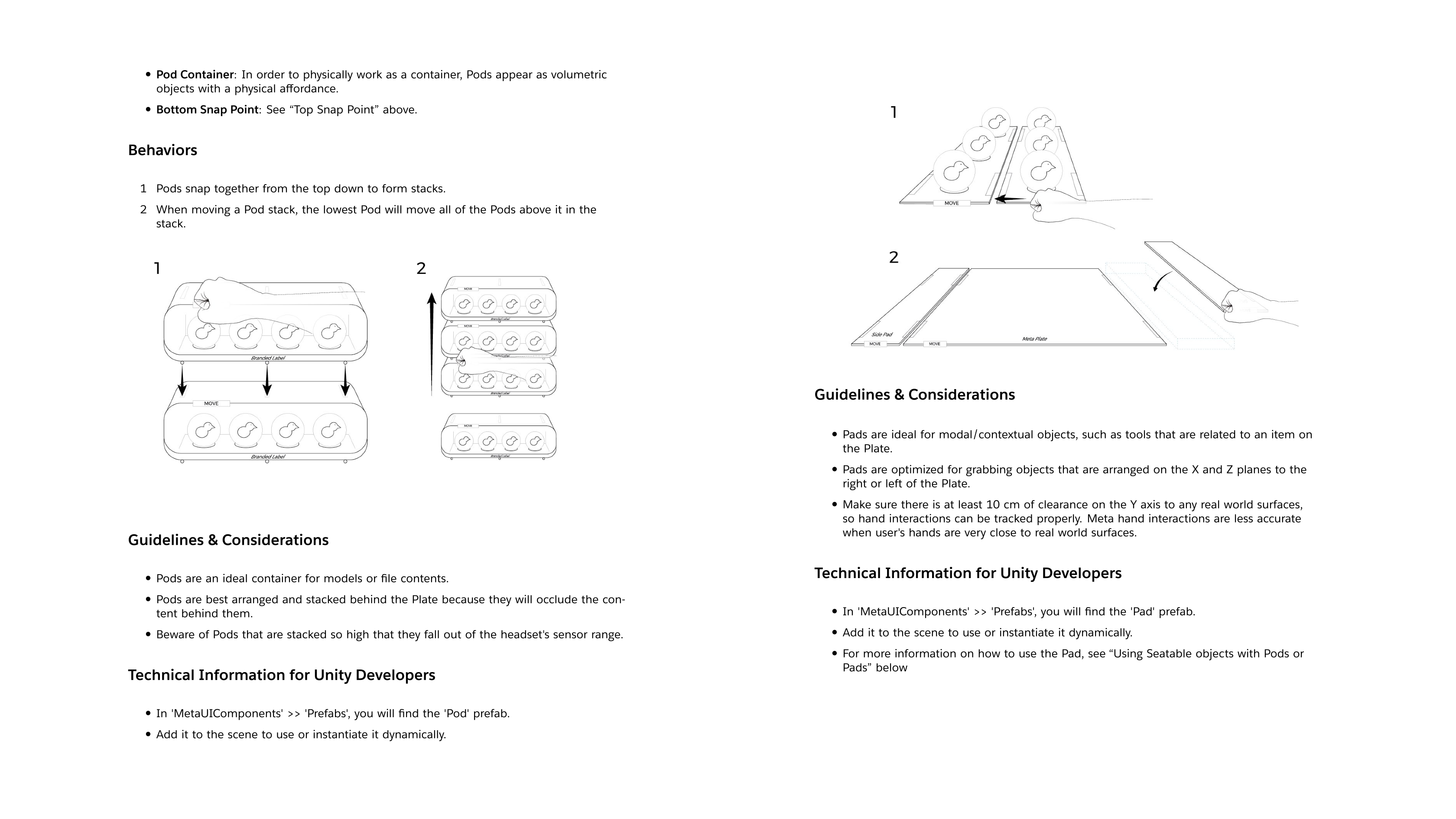
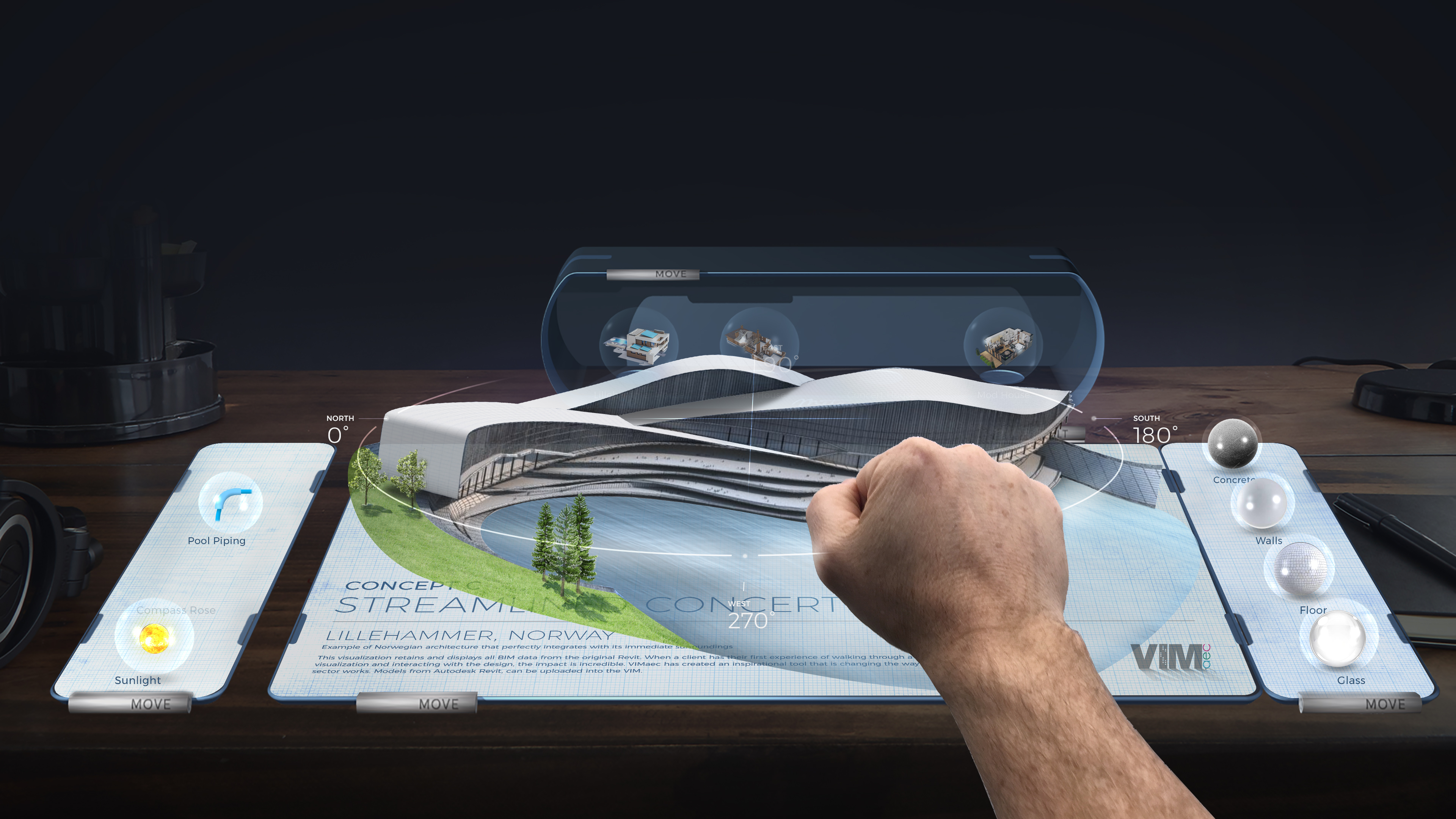
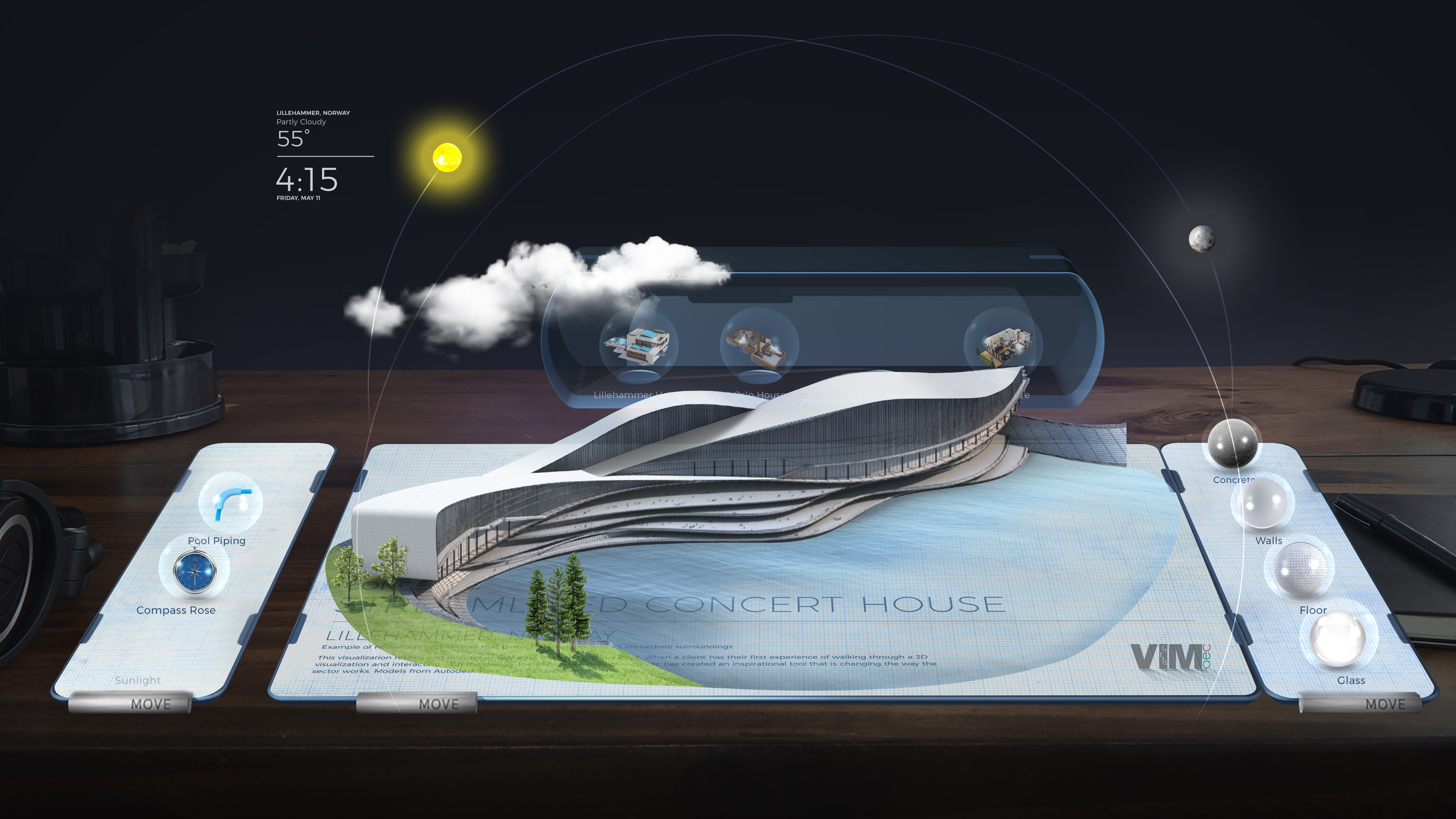
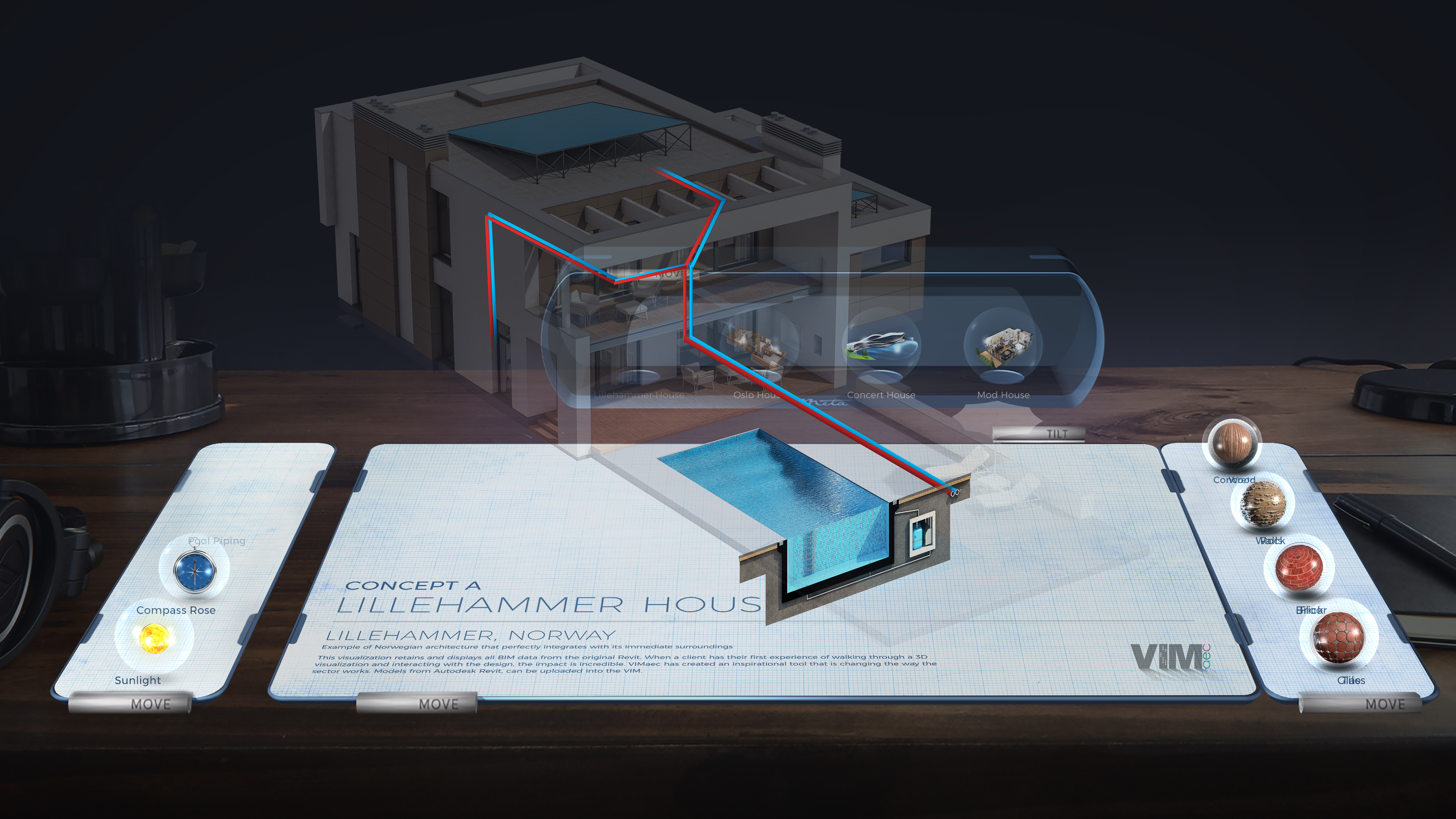
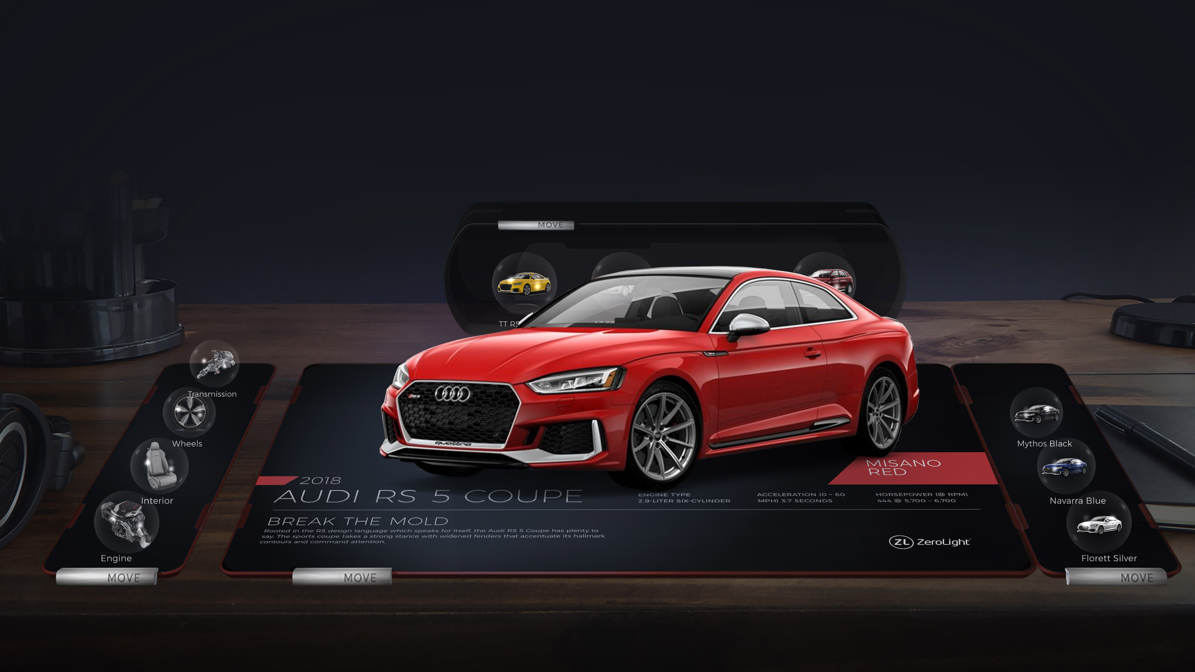
ESSE – Experiential Spatial Environment / A term I coined, ESSE, as in S (es) and E for what I was seeing as a burgeoning spatial operating system, an experiential spatial environment. It just all had to be hooked up in a cohesive manner. We had all the pieces which came out of months of isolation in numerous white boarding sessions resulting in a set of UX guidelines, visual concepts, a live working model viewer and a video demo shown to the public. This was arguably the most revolutionary, touch to see, AR experience in the world. Below are some of the ideas and concepts that drove the final result.
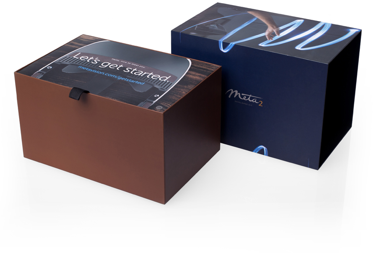
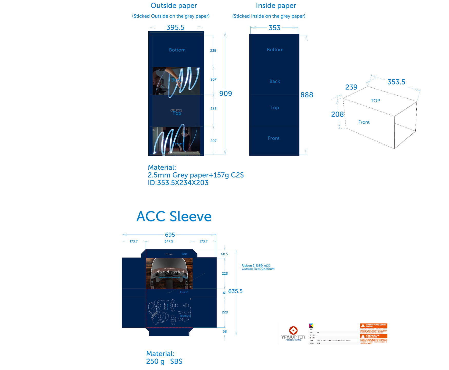
Packaging / In order to get the headset in the hands of paying customers, I designed a complete packaging system down to labeling, accessories and an out-of-box experience.
One of my greatest accomplishments and honors was to hear a quote from an Apple executive giving praise to the packaging at how sophisticated it was. That was truly a validating moment in a long process to get to market.
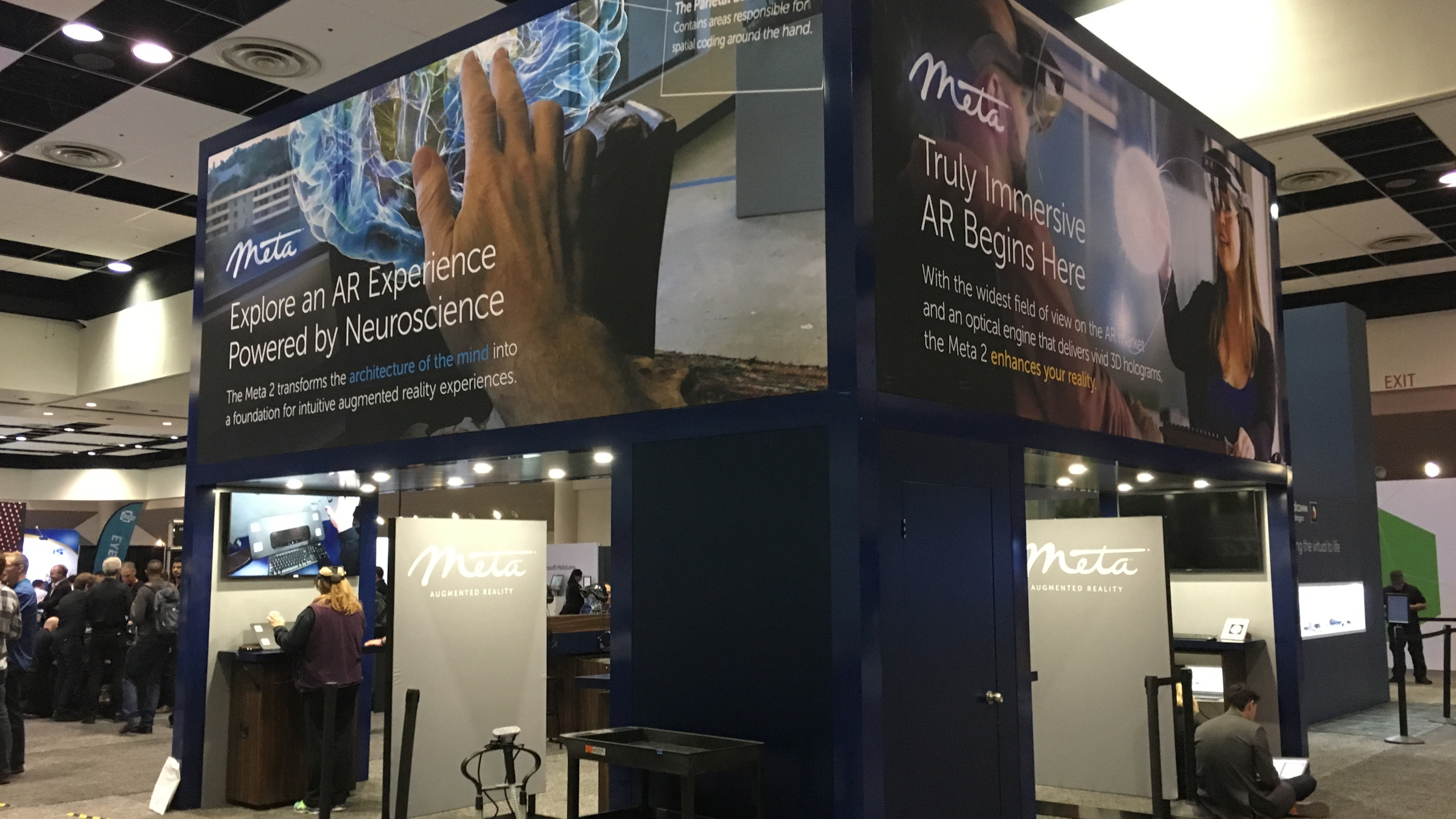
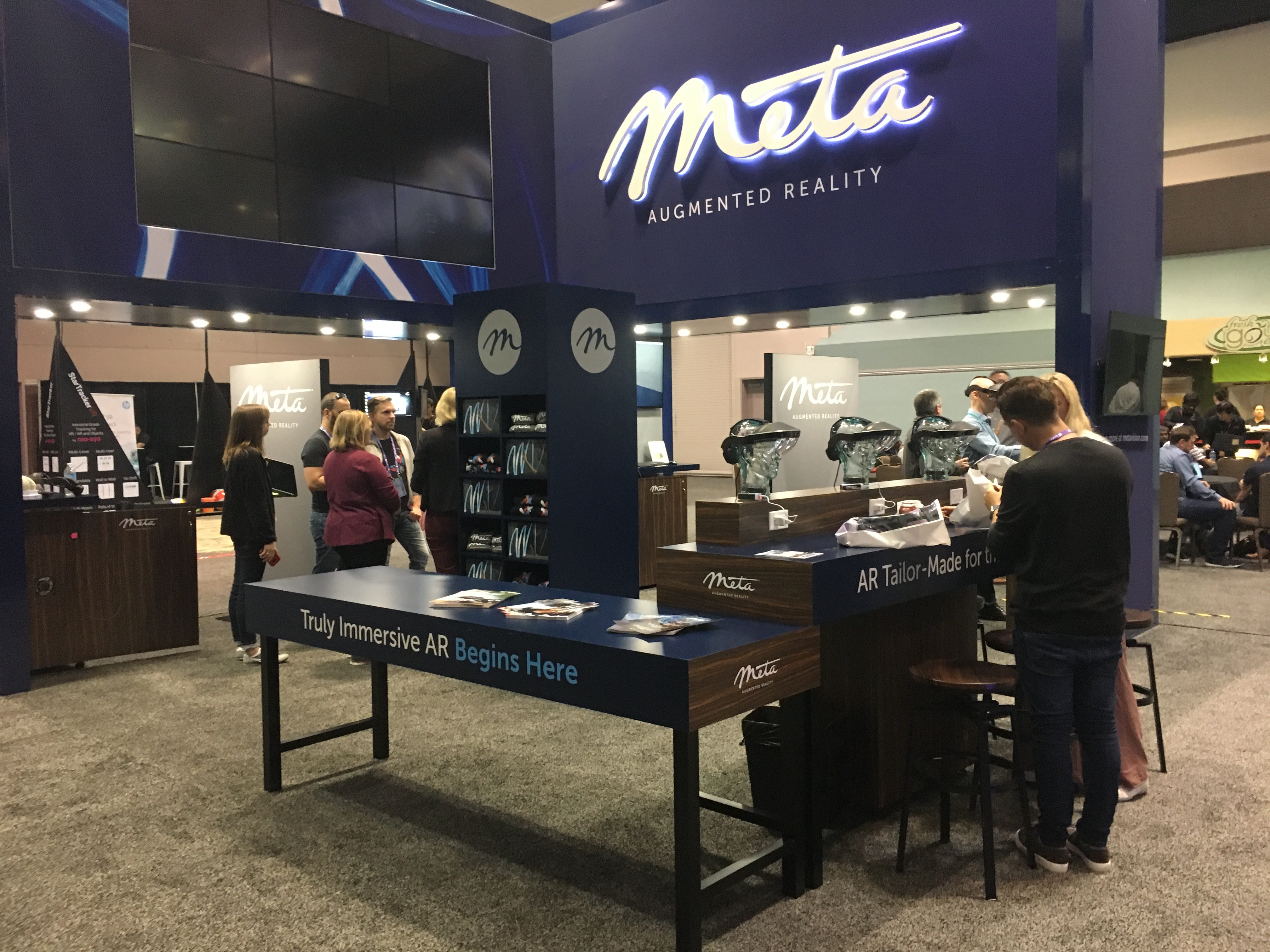
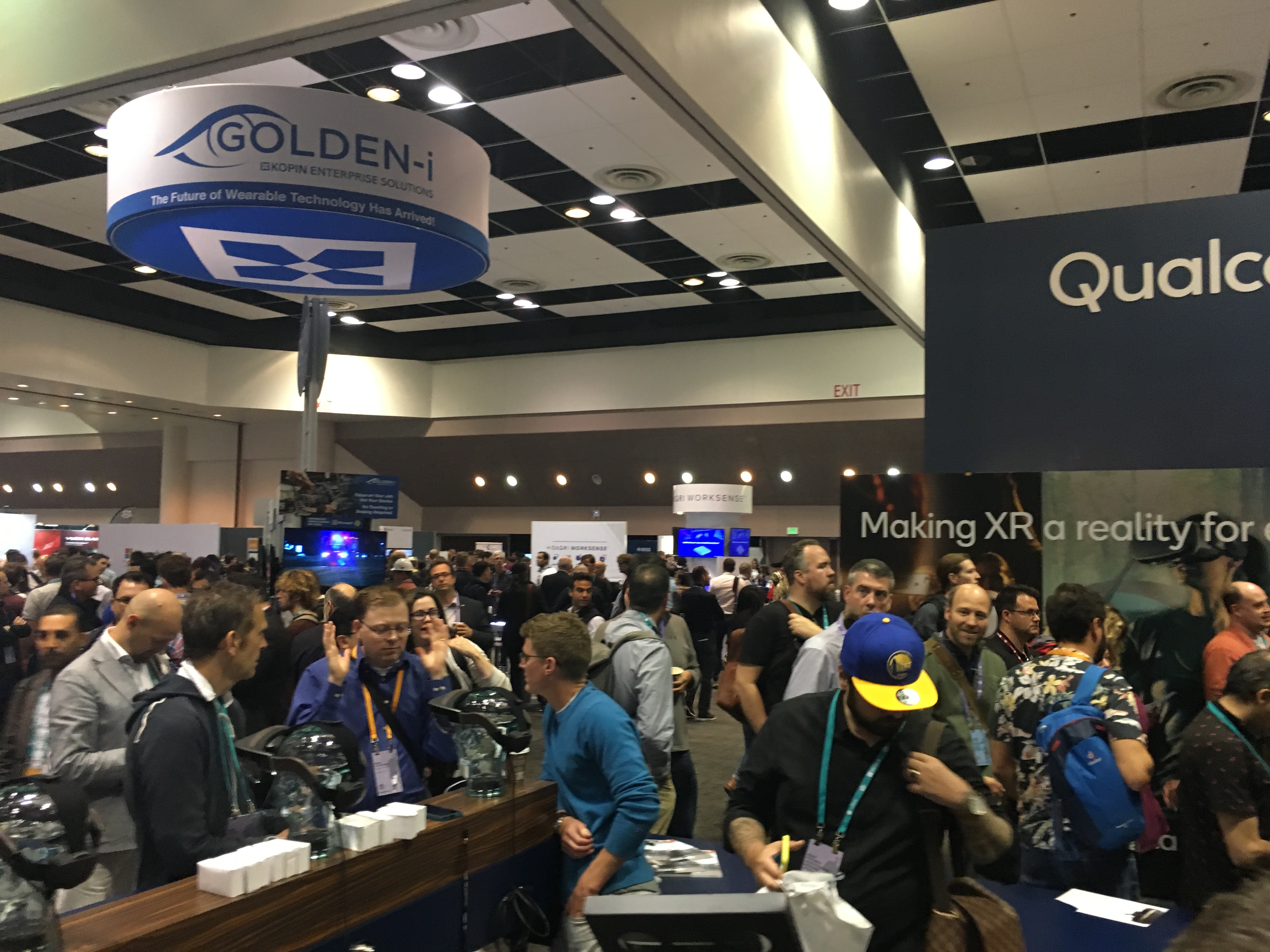
AWE event success / One of my last orders of business as the brand creative was to establish an event experience to rival the rivals. We went from the first year of AWE walking around being a look-see and having a hotel room for demos while winning big, to the next year putting a stake in the ground with a 10'x20' booth. This set us firmly in position as we had long lines all day -every day to view demos and talk shop.
By the third year, we had top placement and the biggest booth, and again stole the show with stellar demos and a prime main stage talk with a live, on stage demo.
Below: The Meta 2 booth, AWE, May 2018 before the crowds and during. There’s my wife again! Brand ambassador.
Results / At the end of the day, Meta was one of the three big players in the AR space. I am proud to have been a part of the experience team to develop the world's first, reach out to touch 3D objects in space and pushed AR forward in concept and execution.
Loyal subscribers / Grew marketing site viewership over the course of a 2 year period.
3X growth / Grew our event footprint from nil to top dog in three seasons.